Kinetic Type for the Rest of Us: A Practical Guide for Designers
Motion is no longer a “nice to have” in brand systems—it’s part of how typography is experienced. Logos breathe, headlines glide, and variable fonts flex weight and width to signal state and tone. The hurdle for many designers has been time (and software). You don’t always need a full After Effects stack to add life to a specimen, case study, or landing page. With a few careful choices—and some help from modern AI utilities—you can turn strong type into clean, believable micro-animations that respect readability and licensing.
Below is a field-tested approach tailored for type lovers who want motion without the mess.
Why move type at all?
- Hierarchy becomes intuitive. Weight, scale, and easing guide attention better than static arrows and boxes.
- Brand voice extends to behavior. A humanist sans can soften a reveal; a narrow grotesk can snap between states; a slab can “thud” into the grid.
- Systems scale. Once you define motion rules for headings, labels, and captions, you can roll them across formats with minimal rework.
The key is restraint. Good kinetic type feels like typography that happens to be moving, not motion graphics wearing a type costume.
Three paths to motion
| Workflow | Best for | Strengths | Caveats |
| After Effects (or equivalent) | Narrative idents, complex morphs | Infinite control, plugins, graph editor | Learning curve; longer render times |
| CSS/JS on the web | Micro-interactions, hover/scroll effects | Lightweight, responsive, accessible if coded well | Limited to DOM/SVG; browser quirks |
| AI-assisted utilities | Fast social cutdowns, prototypes, client previews | Minutes to results; easy iteration | You must police legibility and taste |
For the last category, GoEnhance AI slots neatly into a type-first workflow when you want to test ideas quickly and keep production nimble.
A designer’s quick loop with GoEnhance AI
- Start from a static specimen. Export a high-res PNG or short MP4 of your composition (logo lockup, headline stack, or a variable-font demo). Use a neutral background with generous margins.
- Add subtle camera motion, not gimmicks. Use the picture animator free tool to create a gentle dolly, parallax, or tilt. Keep movement under ~3% of the frame and choose ease-in/ease-out curves so the last frame could double as a static poster.
- Stylize sparingly. If you want a cel, toon, or halftone look for social, run your clip through video convert into animation. Pick styles that preserve counters and apertures; avoid filters that blur hairlines or close bowls.
- Export and test on the real device. Most misuse of kinetic type is obvious only on a phone. Check contrast, letterfit, and the safe area above UI chrome.
This loop is fast enough for stakeholder previews and robust enough for production if you keep a few typographic rules in mind.
Typographic rules that survive motion
1) Choose the right weight.
Hairlines break under compression and blur with motion. Start with Regular or Medium, and step up to Semibold if your background is busy.
2) Respect optical size.
Variable families with an opsz axis are your friend. At caption sizes, increase x-height and tracking; at display sizes, you can tighten rhythm and let contrast breathe.
3) Animate the axes, not outlines.
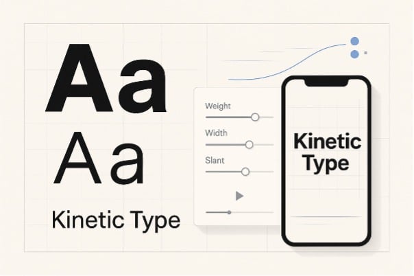
Small, purposeful moves—wght 400→550 over 200–400 ms, or wdth 100%→92% for a snap—read as design, not distortion. Keep your baseline stable unless you’re explicitly communicating bounce.
4) Easing communicates personality.
A crisp grotesk likes cubic ease with a short settle. A friendly humanist sans can linger on the deceleration. Save overshoot for display words; never on body.
5) Protect counters and joints.
Avoid motion blur that fills counters in /a/, /e/, /o/, /g/. If you want “cinematic” blur, limit it to backgrounds or vector elements around the type.
6) Color and contrast first.
Stay in sRGB; set background and text with at least WCAG AA contrast. Motion is no excuse to miss accessibility.
Asset prep that saves time
- Canvas & safe area. Design for both 1920×1080 and 1080×1920. Keep essential copy within a 10–12% margin to avoid UI overlaps.
- Use an 8-pt grid and anchor motion to it. Snapping endings to the grid makes motion feel intentional.
- MP4 (H.264) at 10–12 Mbps is adequate for social. For the web, consider a high-quality WebM fallback.
- Export the first and last frames as PNGs for email or no-motion environments.
Variable font etiquette and licensing
- Check the EULA before distributing motion files that embed fonts. Many open-source families permit it; some commercial licenses require a broadcast add-on.
- Don’t fake italics or bold via skew or stroke. If your family includes slnt or ital, animate those legally supported axes.
- Credit where it helps discovery. In case studies, name the family and the foundry. FontsArena readers appreciate the breadcrumb.
Excellent open-source families that behave well in motion include Inter, Source Sans 3, and IBM Plex. Their generous glyph sets and consistent metrics make them predictable under scale and weight changes.
A tasteful motion vocabulary (steal this)
- Reveal: Mask from left with 16–24 px feather; wght ease from 500→450 as it settles.
- Emphasis: Brief wght 450→600→450 over 150 ms; increase tracking +2 to +6 afterward to prevent optical crowding.
- Swap: Cross-fade between two headings with an 80 ms overlap; keep baseline locked.
- Loop: For banners, limit loops to 6–8 seconds and return to a stable frame so users can read at any entry point.
Quality checklist before you export
- Counters stay open in the smallest viewport.
- Tracking is generous on lowercase words with tight curves (/s/, /a/, /e/).
- Numerals set clearly on busy footage; consider tabular lining for pricing.
- Final frame works as a static card for social or email.
Where AI fits in 2025 (and where it doesn’t)
Generative video is having a moment: longer shots, better color stability, more natural motion. It’s tempting to hand everything to a model. Resist the shortcut. Use AI to build speed around typography—not instead of it. GoEnhance AI’s utilities are perfect for:
- Prototyping motion rules on real copy before investing in full production.
- Creating tasteful parallax or dolly to make a static specimen breathe.
- Converting a finished cut into a stylized animation without rebuilding the project.
But keep typographic judgment in the loop: choose families with sturdy forms, keep your axes ranges tight, and trust your eye for spacing.
Closing thoughts
Kinetic type is typography first. Tools are just levers that let you demonstrate hierarchy, tone, and rhythm in motion. If you define a small vocabulary of moves, keep weights honest, and test on the device your audience actually uses, your work will feel crafted—whether it was composed in a timeline, a stylesheet, or a quick pass through GoEnhance AI.
Design like a typographer. Move like a director. And ship like someone who respects the reader’s eyes.