The Design and UX Features People Expect in 2026
You don’t get a second chance at a first impression online, and in 2026, that window is almost invisible — the judgment is made in about 0.5 seconds. That’s all it takes for people to decide whether to stay or leave.
Every minute, 175 new websites go live, about three every second. By the time you finish reading this article, hundreds more will exist, all competing for the same attention.
Designers and product teams know we’ve reached a turning point. Adding more functionality doesn’t win trust anymore. Neither does copying what worked last year.
What matters is how quickly a product proves it respects the user’s time, attention, and context. Teams that build complex digital products increasingly rely on partners who deeply understand user behavior, ethics, and long-term product value. This is where SapientPro’s UX and product design expertise becomes especially relevant — helping translate sophisticated systems into clear, intuitive, and human-centered experiences.
Keep reading to learn all about the website features people expect in 2026.
Interfaces That Adapt to How You Feel and Act
People no longer expect to adjust themselves to an interface. They expect the interface to adjust to them.
For years, interaction followed a single path: click, tap, type, repeat. Now, that feels limiting.
Users move between voice, text, visuals, gestures, and touch depending on where they are and what they’re doing. They want products to support that shift without friction.
Here’s the solution: multimodal interfaces.
Instead of forcing one input method, they let people choose what feels natural in the moment:
- a quick voice command while cooking
- a gesture while driving
- text when precision matters
What takes things even further is sentient behavior.
Interfaces begin to react to context rather than commands alone. Tone of voice, pacing, and recent behavior influence how a system responds. If someone opens a work tool after a tense meeting, they don’t expect fireworks or urgency, but calm, clarity, and fewer interruptions.
Advanced AI systems can already read images and tone together, which makes this kind of adaptation realistic rather than theoretical.
What matters to users is not the technology behind it. It’s the feeling that the product meets them where they are, instead of demanding effort.
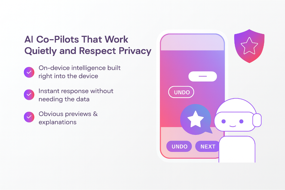
AI Co-Pilots That Work Quietly and Respect Privacy
We’ve all seen and used AI assistants for help; they’re not new. But by 2026, users expect them to sit inside the product and step in at the right moment, without asking for constant permission or attention.
It may seem like a small change, but it’s very important — AI moves from “tool you activate” to “support that’s already there.”
A major reason this feels possible now is on-device intelligence. Rather than sending every request to a remote server, more AI systems run directly on the user’s phone or computer.
That means faster responses and, more importantly, less data leaving the device. From the user’s point of view, things just happen instantly and privately.
But with that convenience comes a clear boundary: users want control. They want to preview what the system suggests. They want to undo actions easily. And they want a short explanation when an AI takes initiative instead of waiting for input.
Learn from the mistakes of others, as many products fail here.
When AI acts without context or explanation, it feels intrusive rather than helpful. When it oversteps, trust drops fast.
The system should assist, not interrupt. It should offer, but it shouldn’t insist.
Personal Experiences Without Crossing the Line
People expect personalization, but don’t want to feel watched. Personalization has been part of digital design for years, yet expectations have changed.
In the future, users will look for experiences that adapt in real time, not ones that rely only on old behavior. Time of day, location, current task, and recent actions all affect what feels relevant in the moment.
This kind of adjustment can be genuinely helpful. Imagine a travel app that surfaces a boarding pass when you arrive at the airport, or a learning platform that instantly slows down when attention drops.
Still, if you’re going down the personalization road, make sure it’s not sloppy. While it’s true that people want personalized experiences, inaccurate or invasive behavior can quickly push them away.
So, how to make sure that trust is a part of the design?
It’s simple, really. Users want to know why something appears. A short “shown because…” explanation removes doubt.
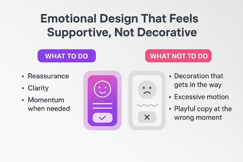
Emotional Design That Feels Supportive, Not Decorative
As products take on more responsibility in daily life, neutrality starts to feel cold. In 2026, users want digital experiences to acknowledge emotion without trying to perform it.
The key lies in that balance, not personality for its own sake, but reassurance, clarity, and momentum when it’s needed.
Emotional design shows up in small decisions:
- the pace of an animation
- the tone of a confirmation message
- the way an error is explained without blame
Typography also plays a role here. Readability, spacing, and even custom fonts all influence how approachable a product feels. When text is clear and consistent, users relax. When it’s cramped or overly stylized, resistance creeps in within seconds.
Now that we know what people want, what is it they don’t want?
- decoration that gets in the way
- excessive motion
- playful copy at the wrong moment
- emotional cues that feel forced break trust quickly
Accessibility as a Starting Point, Not an Add-On
You’ve been there — looking at a product and assuming it will work, not just hoping.
Well, accessibility is no longer framed as a special requirement or a legal checkbox. Users want interfaces to be readable, navigable, and usable across different abilities, devices, and environments from the very first interaction.
When the basics are missing, users don’t complain, but leave. This is what to ensure:
- text must be legible without zooming
- navigation must make sense without relying on sight alone
- motion should never cause discomfort
Designers still rely on established accessibility standards because they work. Clear contrast, consistent structure, and predictable focus order make products easier for everyone, not just users with permanent impairments.
Temporary or situational limits matter just as much, whether someone is in bright sunlight, holding a child, or dealing with fatigue.
Interfaces That Are Honest and Ethically Clear
As we all know, AI has been here for a while; it’s very present as a part of everyday products. But what’s changed is that users want to know when automation is involved and what it’s doing.
Hidden logic, vague labels, and surprise outcomes feel risky. In 2026, ethical design shows up as plain explanations, visible choices, and an absence of pressure.
And this applies to more than AI. Pricing flows, recommendations, defaults, and consent screens all communicate intent. When a product explains why something appears, trust builds.
When it hides fees, nudges emotions, or makes reversal hard, users spot the pattern, and very quickly.
From a UX perspective, ethics lives in the details:
- a short line that explains a suggestion
- a clear toggle during onboarding
- a log that shows what the system changed and when
Most UX design mistakes in this space come from silence, not intent. When a system acts without context, users assume the worst. When it explains itself simply, they stay.
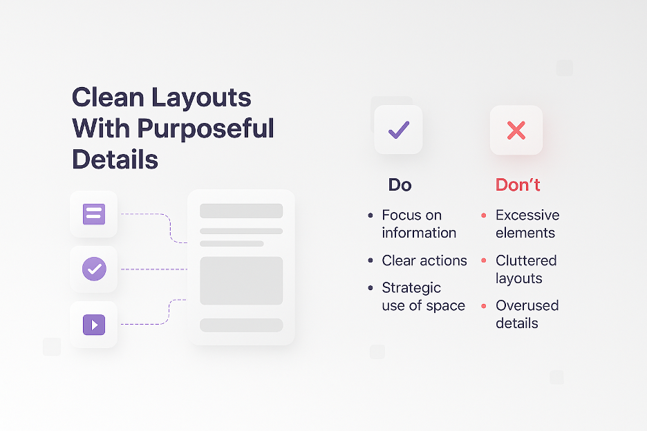
Clean Layouts With Purposeful Details
It’s always been true: less is more.
Feature-heavy interfaces have a cost. They slow down decisions, increase errors, and exhaust attention. In response, people have a clear expectation: interfaces should feel lighter, even when they actually do more.
What we mean is functional minimalism.
It focuses on two things, structure and intent:
- information appears only when it helps
- actions feel obvious without instruction
- space becomes a tool, not an aesthetic choice
Keep in mind, this doesn’t mean stripping products down to the bone, but prioritizing essential features. Anything else comes secondary.
Put yourself in your users’ shoes. When they open a tool, they want to know where they are, what’s important, what to do next.
Micro-interactions help, but when they stay out of the way. A soft transition that confirms something changed, or a quick highlight that shows where the attention just moved, is often all a user needs to feel oriented.
Sustainable and Mindful Experiences
People are becoming more aware of what digital products cost them, not just in money, but in time, attention, and energy. Sustainability is something users feel, even if they don’t name it.
Digital sustainability, from a user’s point of view, is simple:
- pages load fast
- apps don’t drain batteries for no reason
- interfaces work smoothly even on slower connections
- nothing feels heavier than it needs to be
Behind the scenes, this expectation aligns with updated web sustainability guidance that encourages lighter assets, smarter data use, and performance budgets.
We’re not talking about restriction, but efficiency that benefits both the environment and the person using the product. Fewer scripts, optimized images, and restrained motion reduce energy use while improving responsiveness.
Users notice the difference immediately. They will feel calm when they open a page without delays, or when they use an app that doesn’t overheat their phones.
This naturally connects to digital well-being. When products load quickly, they reduce cognitive strain. When they avoid endless loops or aggressive prompts, they give users room to breathe.
Final Thoughts
Don’t think that good design will help you impress. On the contrary, it’s expected; it will feel obvious.
People will want digital products to respect their time, adapt without overstepping, and stay clear even as systems grow more complex.
Here’s the reality — when an interface does a bad job, users will lose trust and feel frustrated. However, when it does its job well, they still won’t stop to admire it. They’ll simply move forward, but without friction or doubt.
And that’s precisely why you should think about a design that knows when to act, when to stay quiet, and when to explain. Trust is built through consistency, not promises.