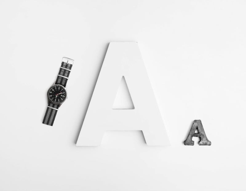
Typography Basics Students Can Learn Fast for Better Visual Projects
Ever looked at a design and felt something was off—but couldn’t explain why? Chances are, it was a typography issue. Typography is more than just picking a pretty font; it’s the art of making written content not only readable but visually impactful. And here’s the good news—you don’t need a design degree to get the basics right.
Whether you’re creating a presentation for class, a social media post, or a flyer for an event, understanding typography can instantly improve your visual projects. In this guide, we’ll break down the fundamentals into easy, beginner-friendly tips you can start using today.
1. What Is Typography and Why Does It Matter?
Let’s start with the big question: What even is typography? In simple terms, typography is the way text is styled and arranged. It includes fonts, spacing, alignment, and how all the letters come together to create a visual message.
Think of typography as the tone of voice for your words. Just like how someone can whisper, shout, or sing the same sentence, fonts can express mood, purpose, and energy.
Here’s why it matters:
- It affects readability—how easy your text is to read.
- It influences first impressions—people judge design in seconds.
- It shapes emotional tone—different fonts convey different feelings.
Imagine writing a birthday invite in Times New Roman. Boring, right? Now picture it in a playful, handwritten font like Comic Neue or Pacifico—it suddenly feels fun and festive. That’s typography in action.
Typography also plays a powerful role in academic work, especially when it comes to research papers and presentations. A clean, well-structured layout with consistent fonts can make your arguments more persuasive and your content easier to digest. Using proper headings, readable fonts, and spacing not only boosts readability but also shows professionalism and attention to detail. And if you’re ever stuck trying to polish the visual flow or formatting of your paper, don’t stress — students can always get support from professionals, including services provided by PapersOwl at https://papersowl.com/research-paper-editing, which can help ensure your work looks as good as it reads. After all, strong content deserves a strong presentation.
2. Understand Font Categories: Serif vs. Sans Serif
One of the first beginner typography tips is learning the difference between serif and sans serif fonts. It’s like knowing the difference between formal and casual clothes.
Serif Fonts: The Classics
Serif fonts have tiny “feet” or strokes at the ends of letters. Think Times New Roman or Georgia. These fonts feel traditional, trustworthy, and academic.
Best for:
- Printed materials like books and newspapers
- Formal presentations or resumes
Sans Serif Fonts: The Modern Choice
Sans means “without,” so these fonts don’t have the extra strokes. Fonts like Arial, Helvetica, and Montserrat are sans serif. They’re clean, modern, and minimal, making them perfect for digital use.
Best for:
- Online content, slides, and social media graphics
- Youthful or tech-forward brands
A good rule of thumb? Use one serif and one sans serif font together—this creates a nice visual contrast without clashing. Canva even has built-in font pairings that do this for you!
3. Master the Art of Font Pairing
Font pairing is like choosing an outfit—each piece should complement the other. When done right, it creates a smooth, stylish look. But when done wrong? It’s like wearing stripes with polka dots and cowboy boots.
Quick Font Pairing Tips:
- Contrast is key: Use a bold font for headings and a simpler one for body text.
- Stick to 2–3 fonts max: Too many fonts = visual chaos.
- Pair styles, not just fonts: For example, a bold sans serif heading with a light serif paragraph.
Example:
Heading: Playfair Display (serif, elegant)
Body: Lato (sans serif, clean)
This combo feels both classy and modern—a perfect balance.
Most tools like Adobe Express, Figma, and Canva suggest combinations automatically. Use that feature to your advantage!
4. Size, Spacing, and Alignment: Small Details, Big Impact
Typography isn’t just about choosing fonts—it’s also how you use them. Three things that can make or break your design: font size, spacing, and alignment.
Font Size: Establish a Visual Hierarchy
Visual hierarchy means guiding the viewer’s eye through the content. You can do this by using different font sizes:
- Titles: 24–36 pt
- Subheadings: 18–24 pt
- Body text: 12–16 pt
Bigger isn’t always better—make sure the size matches the importance of the text.
Line Spacing (Leading) and Letter Spacing (Tracking)
If your text feels cramped or hard to read, check your spacing.
- Line spacing: Add breathing room between lines. Start at 1.4–1.6x the font size.
- Letter spacing: Don’t squish letters too close together. Slightly increasing tracking can improve readability.
Alignment: Left, Center, or Right?
Left-aligned text is easiest to read for most audiences (especially in English). Center alignment works well for titles or quotes. Right alignment? Use it sparingly—mostly in design-heavy layouts.
5. Avoid These Common Typography Mistakes
Now that you know what to do, let’s quickly cover what not to do. These typography traps are easy to fall into but just as easy to avoid once you’re aware of them.
Overusing Decorative Fonts
Sure, fancy fonts can look cool—but less is more. Use them sparingly, like for headlines or logos. Never use a decorative font for large chunks of text.
Using Too Many Fonts
This one’s a classic beginner mistake. Keep it simple—two fonts, three max. Otherwise, your design looks messy and inconsistent.
Poor Color Contrast
White text on a light yellow background? No thanks. Always make sure your text color contrasts clearly with your background. Dark-on-light or light-on-dark is a safe bet.
Not Testing on Different Devices
Fonts can render differently on phones vs. desktops. If you’re working on a project that others will view online, always preview it on multiple screens.
Conclusion: Typography Is a Superpower—Use It Wisely
Typography might seem small, but it plays a huge role in making your visual projects stand out. By mastering the basics—like font categories, pairing, spacing, and alignment—you can instantly level up your designs, even as a beginner.
Remember, design isn’t just about how something looks—it’s about how it feels and communicates. Typography is one of your most powerful tools in that process.
So next time you’re working on a presentation, social post, or flyer, ask yourself:
“Is my text saying what I want it to—visually?”
With just a little practice, you’ll stop using fonts randomly and start using them intentionally. And that’s when the magic happens.