
Typography for Instagram that holds up on a phone
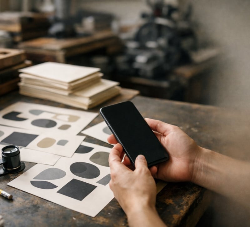
The carousel looked fine on the laptop. On the phone, the paper descriptions were unreadable, and the headline nearly touched the edge. Take a small letterpress and print studio in Providence, Rhode Island, as the example, preparing a five-slide carousel about choosing paper weights. A layout that felt spacious on a monitor turned into a squinting exercise on a five-inch screen.
The phone preview caught the problem before publication. For designers making educational carousels or quote posts, that check belongs early enough in the process to leave room for changes.
Why type breaks on Instagram
Instagram resizes and compresses uploaded images. Fine strokes can soften, and tightly spaced letters can merge into dark patches. A delicate font that looks crisp in a large export may lose definition at feed size.
Start with a 4:5 portrait canvas, commonly 1080 by 1350 pixels. It gives a carousel useful vertical space in the feed. The profile grid uses a taller 3:4 preview, so a centered crop of that artwork can trim the sides. Check the profile preview before publishing, since crop controls and presentation can change.
Keep essential text inside a generous safe area. An inset of roughly 80 to 100 pixels on a 1080-pixel-wide canvas is a practical starting point. Give quote marks and slide numbers breathing room too.
For body copy, try 48 pixels as a working minimum at that canvas size, then judge the result on your phone. Fonts vary in apparent size, even at identical settings. Open the exported slide at its normal viewing size and hold the phone at arm’s length. If reading takes effort, enlarge the text or cut words.
Choosing and pairing fonts for slides
Use one display face for headlines and one text face for explanations. The display face can express the studio’s personality, while the text face handles distinctions such as cover stock versus text stock.
An open-license pairing such as Archivo Black and Source Sans 3 gives each font a clear job. Test the actual copy, including numerals and punctuation, before committing. For a paper-weight carousel, check how clearly the font distinguishes numerals and how easily its lowercase letters read at small sizes.
Skip hairline weights for essential copy. Compression and downscaling leave very little information in those strokes. Choose a regular or medium text weight, and resist tightening letter-spacing to squeeze in another word. Crowded letters become harder to separate on a phone, especially when the image loses sharpness.
Set explanations flush left. Centered type can work for a short quote post, provided the line breaks follow the thought and the reader can find the next line easily.
Setting a carousel slide by slide
The Providence studio’s example carousel needs one clear job per slide and a predictable place for the explanation. Its five-slide order could be:
- Cover: How heavy should your paper be?
- Explain what paper weight measures.
- Separate text stock from cover stock.
- Match paper choices to print projects.
- Finish with questions to ask before ordering.
Keep most lines around four to eight words. That range encourages editing without turning every phrase into a stack of isolated words. Read the breaks aloud. Keep connected phrases together, especially measurements and the nouns they describe.
On the second slide, explain that US pound weights depend on the paper category. A larger pound number does not automatically mean a heavier sheet across categories. Grams per square meter gives readers a consistent basis for comparing weight, though weight alone does not establish thickness or stiffness.
Number the slides consistently, using a treatment such as 1/5 through 5/5 in the same corner. Keep the size and inset unchanged so readers can check their progress without searching.
Paper photographs need special care. Place type on a solid band when the image has busy fibers or shadows. A soft dark overlay can support light text, but check the brightest area behind every line. If contrast varies across a sentence, deepen the overlay or move the copy.
Testing two type treatments and reading the numbers
Test a specific decision. The studio might compare a wide display headline with a narrower one while keeping the text face unchanged. Changing every font and color at once makes the result difficult to interpret.
Post two similar carousels a week apart, using comparable publishing times and topics with similar usefulness. The second could explain paper finishes using the same five-slide structure. Keep caption length and promotional support reasonably consistent. Differences in subject matter will still affect the response, so treat this as a practical comparison with limits.
Compare likes, saves, and profile visits in Insights. Likes offer a quick signal of approval from someone scrolling past. Saves suggest that a reader wants to keep the post for later, a useful response to reference material about print specifications. Profile visits indicate interest beyond that individual post. Check whether the visit figure belongs to the post or the account over that period.
Some studios add a modest batch of Instagram likes from Fameoria when a launch carousel goes up, and one package can be split across several posts as long as each gets at least 50. That makes the counter look less lonely on day one. It says nothing about whether your headline face survives compression, and nobody orders letterpress cards because of it.
If either test receives paid likes, record that separately and leave those additions out of the design comparison. Consider differences in exposure before crediting the font, too. A single pair of posts can suggest what to try next without proving that one treatment caused the response.
Licensing fonts for social posts
Free to download does not always mean free for commercial use. Before using a font in a studio’s posts, read the license included with the download.
Fonts released under the SIL Open Font License can be used commercially in social graphics. That includes promotional carousels and quote posts advertising your own products. Creating a flattened image with the font does not require publishing your artwork under the font’s license.
Keep a copy of the license with the project files. If you share font files with a collaborator or modify the font itself, check the redistribution and naming conditions. Choose a trusted download source that includes the license text.
For its next carousel, the example studio enlarged the explanations and replaced the hairline headings with a sturdier weight. It pulled every text block inward and checked the profile crop.