Typography That Ships: How To Choose And Implement Fonts In Mobile Apps Without Slowing Them Down
Daniel Haiem
Daniel Haiem is the CEO of AppMakers USA, a mobile app development agency that works with founders on mobile and web builds. He is known for pairing product clarity with delivery discipline, helping teams make smart scope calls and ship what matters. Earlier in his career he taught physics, and he still spends time supporting education and youth mentorship initiatives.
Typography is one of those details teams obsess over in mockups, then accidentally break in production.
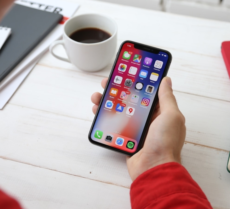
On a real phone, text is doing a lot of work. It carries navigation labels, form errors, prices, and the tiny legal copy nobody reads until something goes wrong. If your type choices are slightly off, users feel it as friction: harder scanning, more mis-taps, more squinting.
The fix is not “pick a nicer font.” The fix is treating typography as both a design system decision and an engineering decision.
This guide is a practical way to do that, without turning the project into a rabbit hole.
Start with the job the text needs to do
Before you choose a typeface, write down where your text actually lives. Not in the marketing screenshots. In the messy parts of the app.
Think about:
- small sizes on small screens (labels, captions, footers)
- bright outdoor lighting
- one-handed use and quick scanning
- long lists where people skim
- accessibility settings that increase text size
A typeface that looks great as a hero headline can fall apart at 12 to 14px in a dense settings screen.
A practical move: build a tiny “type torture test” screen early. Three sections is enough.
- A settings list with long labels
- A checkout style form with errors
- A product list with prices and small badges
If your font survives those, it will survive most of the app.
Also, test it like a user, not like a designer. Put the phone on low brightness. Walk outside. Turn on dark mode. If you have to squint, your users will too.
Pick fonts based on readability, not vibe
Brand matters. But in apps, readability is the brand.
Here’s what makes a UI font hold up at small sizes:
- clear letterforms (especially I, l, 1, 0, O)
- open counters (the “holes” in letters like a, e, o)
- stable spacing at small sizes
- numbers that stay readable in prices and totals
A lot of teams forget the numbers part, then ship a checkout screen where 8 and 0 blur together. That is not a design problem. That is a conversion problem.
Quick test you can do in 10 minutes:
- Mock up a pricing screen with $9.99, $19.99, $199.99
- Add a coupon line and a total
- Set the text at the smallest size you plan to use
If the numerals feel even slightly mushy, pick another font.
Also, use real copy, not lorem ipsum. Real words expose weak readability fast. “Billing address” and “Shipping address” will reveal spacing issues way faster than filler text.
One more practical shortcut: for many apps, system fonts are still the safest baseline. iOS users are trained on San Francisco. Android users are trained on Roboto. If you introduce a custom font, it needs a clear reason and it needs to earn its performance cost.
Build a type scale that makes decisions for you
Most “bad typography” in apps is not the font. It is inconsistency.
A type scale is a short set of text styles everyone uses. It prevents designers from inventing 37 versions of “Body Small” and developers from guessing.
A clean scale usually includes:
- headline (used rarely)
- title
- body
- caption
- label
- button
Keep it tight. The goal is speed and consistency.
Then add rules that remove debates:
- error messages always use the same style
- input labels always use the same style
- prices always use the same style
This sounds small until you ship. Without rules, you end up with a UI where every screen feels slightly different, and nobody can explain why.
If you want it to survive the handoff, name the styles in plain language. “Body” and “Body Small” is better than “Text 14 Regular 1.4.” Engineers can implement what they can recognize.
And pick line heights that breathe. Apps are read fast. If your line height is too tight, scanning gets harder and people miss things.
Variable fonts can simplify your UI stack (and often your file sizes)
A common mobile mistake is shipping a font family like this:
- Regular
- Medium
- Semibold
- Bold
- Italic versions
That becomes multiple files, multiple weights, and a bigger footprint.
Variable fonts let you ship one font file that supports a range of weights and widths. The win is not just size. It is fewer assets to manage and fewer “almost bold” hacks.
Where variable fonts shine:
- your design system uses several weights across the app
- you want consistent weight steps (not just regular vs bold)
- you want fewer files to track and fewer surprises in builds
Where they are not automatically worth it:
- your app uses only one weight and one style
- you need maximum compatibility with older stacks
The practical advice: treat variable fonts as an option, not a default. Test file sizes, test rendering, and confirm the app still feels fast.
Font performance is part of app performance
Fonts rarely crash an app, but they can quietly slow it down and inflate your app size.
This matters more than people think. Google Play has shared that for apps under 100MB, every 6MB increase in APK size is associated with about a 1% drop in install conversion. Fonts are not the only contributor, but they are an easy one to control.
Here are the issues that show up in real builds:
- large font files that inflate app size
- too many weights included “just in case”
- first render delays when fonts load late
- inconsistent rendering between iOS and Android
A practical performance approach:
Subset what you ship
If your app is English-only, you do not need the full world of glyphs. If you support a few languages, you still might not need everything.
Subsetting fonts to the characters you actually need can reduce weight a lot. This is especially true for families with broad language coverage.
Limit weights on purpose
If your UI uses Regular, Semibold, and Bold, ship those weights only. Most apps do not need five weights.
A good rule of thumb: if a weight is not used in the design system, it should not be in the build.
Treat typography like a budget
Make it a real constraint, not a nice-to-have:
- max number of font files
- max total font size
- approved weights only
Once it is a budget, you stop adding fonts casually.
Accessibility is where typography gets real
If you want your app to be usable for a wide range of people, typography needs to hold up under stress.
That includes:
- larger text sizes
- different contrast environments
- users who rely on scanning instead of reading
This is not a small audience. Globally, at least 2.2 billion people have a near or distance vision impairment. Even if your app is not “for” accessibility, your users are.
Two practical rules that prevent most issues:
Respect system text sizing
If your app ignores user text-size settings, you are choosing aesthetics over usability. Support dynamic text scaling and test it early.
Do not wait until the week before launch to flip on large text. That is how you end up redesigning buttons and cards under pressure.
Design for reflow, not clipping
The most common accessibility failure is when larger text breaks layouts:
- buttons truncate
- labels overlap
- cards overflow
The fix is boring, which is good:
- allow multi-line labels
- avoid hard height constraints
- give text room to grow
If your typography scales cleanly, the whole app feels higher quality.
Localization changes typography more than people expect
If you plan to support multiple languages, typography becomes more than Latin letterforms.
Things that break:
- text length (German strings often get longer)
- line height needs
- punctuation and spacing rules
- font fallback behavior
Practical ways to avoid surprises:
- plan for text expansion on key screens (buttons, tabs, headers)
- avoid all caps for labels, since some languages become harder to read
- define fallback fonts that still feel on-brand
- test key screens with real translated strings early
A simple trick teams use: pseudo-localization. It stretches strings on purpose so you can spot where layouts will break before translation is even done.
If you wait until the end, localization becomes a redesign.
Licensing is not optional
This part is not fun, but it matters.
Teams get burned when they:
- use a font in a way the license does not allow
- assume “free to download” means “free for commercial app embedding”
- forget that app distribution is a form of redistribution
Before you ship:
- confirm the app embedding rights
- document the license in your design system
- keep a list of every font used and where it appears
Make it boring and documented. That is how you avoid surprise legal cleanup late in a release.
A clean designer to developer handoff checklist
If you want typography to survive the jump from Figma to production, align on specifics, not vibes.
At minimum, the team should agree on:
- final font files and formats
- approved weights and which screens use them
- exact text styles (size, weight, line height, letter spacing)
- dynamic text behavior (what scales, what does not)
- truncation rules (single-line vs multi-line)
- fallback fonts and language coverage
One thing that helps a lot in real teams: a single “typography preview” screen in the app. It shows every text style and a few real UI samples. Designers can sanity check, engineers can verify spacing, and everyone can spot drift early.
This is where a lot of apps quietly lose quality. Developers “approximate” a style, then the app feels slightly off everywhere.
The goal is not prettier type. It is faster comprehension
Great typography makes an app feel calm. It reduces cognitive load. Users find what they need without thinking about it.
And that outcome comes from details that are surprisingly practical: a tight type scale, fewer weights, predictable rules, proper accessibility scaling, and performance budgets.
I’ve seen teams ship gorgeous designs that still feel frustrating because the text is cramped, inconsistent, or hard to scan on a real phone. The fix was never “make it prettier.” It was making the system consistent and readable under real conditions.
If you want a team that can help you design the typography system and implement it correctly on iOS and Android, work with a mobile app development agency that treats design systems and performance as build requirements, not polish at the end.
The best apps do not win because their font is trendy. They win because users can understand them quickly, on any screen, in any context, without friction.