When Typography Leaves the Screen: Designing Fonts for Print, Texture, and Touch
Typography lives everywhere—on websites, in brand identities, across social media feeds—but it behaves differently once it leaves the screen. The moment a typeface moves from pixels to paper, its character changes. Weight feels heavier. Contrast becomes more pronounced. Letterspacing responds to ink and fiber instead of light.
Designers who primarily work in digital environments often discover this shift only when their work is physically printed. What appeared refined on screen may feel crowded in print. A delicate serif may lose clarity at small sizes. A bold display face might dominate more aggressively than intended.
The transition from screen to print is not simply technical. It is sensory.
Typography as a Physical Experience
Digital typography is experienced through light. Print typography is experienced through reflection, texture, and proximity. The eye responds differently to ink than it does to illuminated pixels.
Consider the following differences:
- On screen, anti-aliasing softens edges; in print, edge sharpness depends on ink absorption and paper coating.
- Backlit displays increase contrast automatically; in print, contrast depends on stock and finish.
- Responsive design adjusts automatically; printed layout is fixed and permanent.
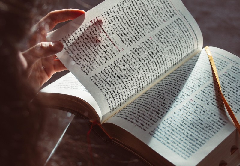
When typography enters print, it gains weight—both visually and metaphorically. It becomes an object. Something to hold. Something that can be touched, annotated, displayed.
This is especially evident in books, where type is not merely functional but foundational.
Paper Changes Type
One of the most underestimated variables in print typography is paper.
Uncoated stock absorbs ink, slightly softening letterforms. This can enhance warmth in literary typography but reduce crispness in high-contrast serif fonts. Coated stock preserves detail but can introduce glare under certain lighting conditions.
Textured papers add another dimension. A subtle grain can give body to minimalist sans-serifs. Deep textures may interrupt thin strokes.
When working on physical publications, designers must think beyond font selection and consider how the material itself will influence perception. The same typeface set at the same size can feel entirely different across stocks.
Typography does not exist in isolation—it collaborates with substrate.
Serif, Sans, and Scale in Long-Form Print
While digital platforms often favor sans-serif fonts for clarity at small sizes, long-form print still leans heavily toward serif families for extended reading comfort.
Why?
Serif typefaces guide the horizontal flow of the eye. In extended reading—novels, essays, scripts—the micro-details of serifs subtly improve rhythm and legibility.
However, modern publishing increasingly blends serif body text with expressive sans-serif display typography for chapter headings and section breaks. This hybrid approach reflects contemporary visual culture, where readers are comfortable navigating contrast.
The key considerations in long-form print include:
- Line length (ideal range: 55–75 characters per line)
- Leading that compensates for ink density
- Margin balance for physical handling
- Optical scaling of type for trim size
Designing for a 5” x 8” novel differs dramatically from designing for a large-format art book. Scale alters hierarchy.
Typography in Art and Limited Editions
Display typography takes on even greater importance in art books and limited-edition publications. Here, type is often part of the visual composition rather than simply a vehicle for information.
Foil stamping, embossing, debossing, and letterpress can elevate typography from graphic element to tactile statement.
When a title is foil stamped, stroke weight becomes critical. Too thin, and detail disappears. Too intricate, and legibility suffers. Designers must adjust letterforms for process.
This is where understanding print production becomes essential. High-end art book printing often requires designers to think not only about aesthetic but about mechanical tolerances—minimum stroke thickness, spacing allowances, and how metallic foil interacts with curves.
Typography in these contexts is architectural. It must withstand pressure, heat, and texture.
Binding and Typeface Rhythm
Binding style influences reading experience and, by extension, typography decisions.
Perfect-bound books restrict full flat opening, which affects gutter margins and inner spacing. Smyth-sewn books open more naturally, allowing tighter margins and more immersive layouts.
Spiral or wire-bound formats—common in workbooks and educational materials—introduce visual interruption along the edge, requiring additional margin planning.
In premium publishing, the integration of typography and structure becomes especially pronounced. Designers working in premium book production often collaborate closely with printers to ensure that layout decisions align with binding mechanics and finishing processes.
Typography is not merely printed onto pages—it must coexist with structure.
The Psychology of Weight and Space
Print exaggerates typographic weight in ways designers sometimes underestimate.
A Medium weight that appears balanced on screen may feel heavier on paper. Letterspacing that seems generous digitally can look excessive in print.
One practical approach is to print sample spreads at actual size before finalizing layout. What feels right at 100% zoom on a monitor may behave differently when physically scaled.
White space also gains significance. Margins become breathing room not just visually but physically. A reader’s thumb occupies space. A page turn creates pause.
Typography in print is choreography.
Scripts, Screenplays, and Typographic Tradition
Certain genres carry typographic expectations. Screenplays follow rigid formatting traditions: monospaced fonts, specific margin settings, structured spacing.
Stage scripts, however, allow more flexibility in published editions. Many contemporary script books use elegant serif faces for dialogue, pairing them with minimalist sans-serif for character names or stage directions.
Typography in these contexts must balance readability with dramatic tone. It must preserve clarity during rehearsal yet maintain aesthetic value as a published artifact.
The designer’s role becomes interpretive—translating performance into page.
Cover Typography: Where Branding Meets Material
Cover design is often where typography must perform the hardest.
On screen, a book cover thumbnail might appear at one inch tall. In print, it may span nine inches or more. The type must function at both scales.
High-contrast serif titles can convey literary prestige. Geometric sans-serif fonts often suggest modernity. Hand-drawn lettering evokes intimacy or memoir.
Yet print introduces additional considerations:
- How does foil stamping alter stroke contrast?
- Will embossing flatten thin serifs?
- Does the spine width affect letter stacking?
Spine typography is especially critical in physical retail environments. A well-balanced spine can determine whether a book stands out on a shelf.
Designers who understand both digital branding and physical manufacturing hold a distinct advantage.
Color, Ink, and Typographic Contrast
Ink behaves differently than RGB light.
Deep blacks in print require rich black builds, but overuse can muddy fine type. Metallic inks reflect unpredictably under directional lighting. Pantone colors may shift slightly depending on stock.
Typography interacting with color fields must account for ink spread and opacity. Thin white type reversed out of dark backgrounds demands careful attention.
In art publications and exhibition catalogs, typographic contrast often defines hierarchy. Large-scale headings may dominate double-page spreads, while fine captions must remain legible without distraction.
The balance between boldness and subtlety defines professional print typography.
Designing for Longevity
Unlike digital media, printed typography endures physically. A book may sit on a shelf for decades. It will be exposed to light, handling, humidity.
Typeface choice therefore carries temporal weight. Trend-driven display fonts may age quickly. Classic serif families often provide durability.
Designing for print is designing for time.
This perspective shifts priorities. Clarity outweighs novelty. Structure outweighs flash.
Typography in print must justify its permanence.
Bridging the Gap Between Digital Designers and Print Reality
As more designers begin in digital spaces, understanding print production becomes increasingly valuable. Many have never considered how trim size affects leading, how grain direction influences folding, or how binding impacts gutter margin.
The most successful print typography emerges when designers collaborate with production specialists early in the process.
Questions worth asking include:
- What is the final trim size?
- What paper stock will be used?
- What finishing techniques are planned?
- How thick will the spine be?
These practical considerations shape typographic decisions.
The goal is cohesion—where font choice, layout, material, and structure operate as a unified system.
Typography That Can Be Touched
Ultimately, print typography offers something digital never can: tactility.
A debossed title invites fingertips. A textured cover alters perception before a single word is read. Thick, creamy paper changes the tone of body text.
When typography leaves the screen, it becomes embodied.
For designers passionate about type, exploring print is not merely a technical exercise—it is an expansion of craft. It demands attention to detail, material awareness, and a deeper understanding of how letters behave in the physical world.
In a time dominated by screens, typography that can be touched may be its most powerful form.