Why Font-Heavy Brands Still Need Physical Delivery Channels When the Goal Is Local Recall, Not Just Digital Style
Typography carries more strategic weight than many businesses realise. A type choice influences perceived tone, legibility, trust, memorability, and even the pace at which information feels readable. Designers know this instinctively. Brand teams know it when a headline suddenly feels right. Readers know it when something looks credible before they fully process why. But there is another question that deserves more attention: what happens after the typography is chosen?
In many branding conversations, the focus stays on the digital canvas. Websites, social graphics, landing pages, email headers, app interfaces, and presentation decks receive most of the energy. Yet a brand is not remembered only because it looks good on a screen. It is remembered because it appears in the right context, with the right repetition, and with enough physical presence to stay in memory. That is where printed delivery still matters.
For local brands in particular, good typography should not end at digital style systems. It should travel into physical communication formats that put the brand in front of people where they actually live. A beautifully chosen type system becomes much more useful when it appears not only in posts and ads, but also in postcards, neighborhood offers, event announcements, and local promotions that people can hold and revisit.
Typography Is About Readability in Context
One of the best lessons from font research is that context always changes performance. A typeface that feels expressive on a website may fail in a crowded printed format if spacing, hierarchy, and scanning behavior are ignored. On the other hand, a type system that is built with both digital and physical readability in mind can strengthen brand consistency significantly.
This matters for postcard marketing because local mail has a simple job: communicate fast without feeling disposable. A reader should understand the brand, offer, and next step quickly. Good typography helps that happen.
Why Local Recall Needs More Than Visual Identity
Brand identity systems are often overvalued as visual assets and undervalued as delivery systems. A company may have excellent fonts, excellent color choices, and excellent templates while still remaining forgettable in its local market. That usually happens because the brand is aesthetically refined but under-distributed. People cannot remember what they do not encounter often enough.
Printed mail solves part of that problem by turning brand style into local repetition. It puts the visual system into homes, into shared spaces, and into slower moments of attention. If the typography is clear and the message is disciplined, the result can be much more memorable than another fleeting digital impression.
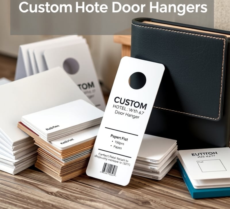
Postcards Are a Practical Stage for Brand Typography
Among print formats, postcards are especially useful because they demand clarity. They force the brand to make hierarchy decisions well. The headline has to work. The supporting text has to stay readable. The call to action has to be obvious. Typography is not decorative in that environment. It is functional communication.
That is why design-forward local businesses often find postcards surprisingly effective. They provide a compact stage where brand voice, visual identity, and local outreach can work together without excessive complexity.
| Brand Element | Digital Strength | Physical Marketing Strength |
| Typography | Sets tone and interface readability | Improves scan speed and recall in print |
| Color and layout | Supports visual consistency online | Helps recognition across repeated mail exposure |
| Postcards | Can echo digital campaign visuals | Creates tangible local visibility beyond the screen |
Why EDDM Fits Brand-Led Local Campaigns
Every Door Direct Mail is especially useful when the objective is broad local recognition rather than highly segmented performance marketing. That makes it relevant for cafes, studios, clinics, events, neighborhood retail, and service brands that want more people in a defined area to recognise the same visual identity repeatedly.
For teams exploring cheap rush printing, the appeal is often straightforward: fast turnaround, practical production, and an easier path from concept to neighborhood visibility. The campaign only works if the mailer arrives on time and still holds the brand system together visually.
And when the goal is route-based local delivery, EDDM Printing helps turn typography and layout choices into actual geographic reach. In other words, the font system stops being only an aesthetic decision and becomes part of real brand memory.
Print Reveals Whether a Font System Is Truly Flexible
A brand font system is not finished just because it looks good in a style guide. It has to survive real use. That means short headlines, long addresses, phone numbers, promotional codes, disclaimers, QR code labels, store hours, and small legal lines. Local mailers quickly reveal whether the chosen typography can handle those ordinary details without losing character or readability.
Some fonts are beautiful but fragile. They work for a hero headline but struggle in small supporting copy. Others are plain but dependable, which can be exactly what a campaign needs. A smart brand system usually includes both: a typeface that carries personality and another that handles the hard work of information. Direct mail forces that hierarchy to become practical.
Designers also need to think about contrast. A thin gray font on a pale background may look refined on a calibrated monitor and still underperform in a busy household environment. A postcard may be read under kitchen lighting, in a stack of mail, or while someone is standing by the trash deciding what to keep. That is not a glamorous design context, but it is a real one.
Local Mail Can Extend a Digital Brand Without Diluting It
The goal is not to make print look separate from digital. The goal is to translate the brand intelligently. A campaign can keep the same type personality, color palette, and voice while adapting spacing, sizing, and hierarchy for physical reading. That translation is where strong design judgment shows.
For font-conscious brands, this can be a useful creative constraint. It asks whether the identity is recognizable without motion, animation, or responsive layouts. It asks whether the type still carries tone when the user cannot click, hover, or scroll. When the answer is yes, the brand becomes more durable.
Designers Should Test the Boring Details First
It is tempting to test a brand system on the most attractive examples first: the big headline, the campaign hero, the dramatic color treatment. But postcards and local mailers expose the boring details, and those details often decide whether the piece works. Can the phone number be read quickly? Does the address fit without looking cramped? Is the offer clear if someone only glances at it for three seconds? Does the QR code have enough quiet space around it?
These questions may not feel as exciting as choosing a beautiful display face, but they are part of typography in the real world. A font system that cannot handle small practical information is not fully ready for campaign use. Direct mail is a good stress test because it compresses identity and utility into a small physical format.
The best designers know that ordinary constraints can improve the final work. When a postcard reads well, the website often improves too. When the hierarchy is clear in print, the digital campaign usually becomes sharper. Physical formats force decisions that can strengthen the entire identity system.
Local Recall Depends on Repetition, Not Just Taste
A brand can have excellent taste and still be forgotten. Recall depends on repeated exposure in places that matter. For local businesses, that means the typography has to leave the design file and enter the neighborhood. It has to appear in mailboxes, windows, counters, packaging, signage, and offers that people actually encounter during daily routines.
This is where print gives typography a different kind of life. The type is not just part of a visual system. It becomes part of memory. A resident may not know the font name, but they may remember the look of the cafe postcard, the studio invitation, or the local service offer. That is the practical value of design beyond aesthetics.
Readable Type Is a Form of Respect
There is a simple human side to all of this: readable design respects the reader. It does not ask people to decode a tiny offer, guess at the deadline, or struggle through a decorative typeface that was chosen for mood over function. A good local mailer understands that attention is limited and treats that limitation honestly.
That does not make the design boring. It makes the design useful. Strong typography can still carry personality, but it should never make the reader work harder than necessary. In physical campaigns, beauty and clarity are not opposites. The best pieces prove they can support each other.
Final Thoughts
Typography matters because it shapes how information feels. But brands are not remembered through design quality alone. They are remembered through repeated visibility in the right contexts. For local businesses, that means even the most refined digital identity can remain underpowered if it never enters the physical environment where real familiarity is formed.
Good type deserves good distribution. And for neighborhood-level recall, physical mail remains one of the simplest ways to give brand style a more lasting presence.