
Why Visual Trust Design Matters When Choosing an Online Gaming Marketplace
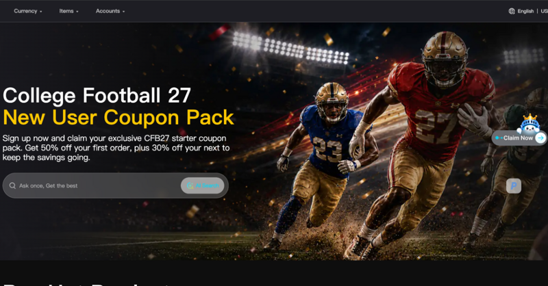
Good design does more than look appealing — it signals trustworthiness, especially in spaces where users are making financial decisions. This is particularly true for online marketplaces where players go to buy game currency, a category where clean layout, clear typography, and intuitive navigation directly influence whether a first-time visitor feels safe completing a transaction. For designers and gamers alike, understanding what separates a trustworthy marketplace from a questionable one often comes down to visual and structural details that are easy to overlook but critical in practice, and that quietly shape user behavior long before any purchase decision is consciously made.
The Role of Design in Building Digital Trust
Trust online is built quickly, often within the first few seconds of landing on a page. Typography choices, spacing, color contrast, and layout consistency all contribute to a subconscious judgment users make before reading a single word of content. Cluttered layouts, inconsistent fonts, or aggressive pop-ups tend to signal low credibility, regardless of whether the underlying service is legitimate, because visual noise reads as a lack of attention to detail across the entire operation.
Marketplaces operating in categories that involve real financial transactions — including gaming currency exchanges — face a higher bar for design trust than typical content websites. Users are not just reading; they are deciding whether to enter payment information, which makes design clarity a functional requirement rather than a purely aesthetic one. This is especially true for first-time visitors who have no prior relationship with the brand and are relying entirely on visual cues to judge legitimacy within seconds of arrival.
Design Elements That Signal a Trustworthy Marketplace
Certain design patterns consistently appear across marketplaces that successfully build user confidence, regardless of the specific product category.
1. Clear Typographic Hierarchy
Well-designed marketplaces use consistent heading sizes, readable body text, and clear visual separation between sections like pricing, delivery information, and support. This reduces cognitive load and helps users find what they need without confusion, particularly important for users making quick decisions between gaming sessions.
2. Consistent Branding and Visual Identity
A cohesive color palette, consistent logo placement, and unified iconography across the site reinforce professionalism. Platforms like IGX.gg maintain visual consistency across their listings and checkout flow, which reduces the sense of friction users often feel on less polished marketplaces where design inconsistencies raise unconscious doubt.
3. Transparent Layout for Pricing and Policies
Trustworthy platforms avoid hiding fees or policies behind excessive clicks. Clear, upfront presentation of pricing structures and delivery timelines is a design choice as much as a business one, and it directly affects conversion and repeat usage, since users who feel misled once rarely return for a second purchase.
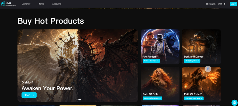
Why This Matters More in Gaming-Adjacent Marketplaces
Gaming currency marketplaces occupy a slightly different trust category than typical e-commerce. Buyers are often making quick decisions during active gaming sessions, meaning the design needs to communicate credibility almost instantly. A cluttered or slow-loading page can cost a marketplace a transaction simply because the user does not have the patience to dig for reassurance while a match or event window is actively ticking down.
This is why the best-performing platforms in this space tend to invest heavily in interface simplicity — reducing steps between browsing and checkout, and making trust signals like reviews or delivery guarantees visually prominent rather than buried in footer text where they are unlikely to be noticed by a time-pressed buyer.
The Typography Details Designers Often Overlook
Beyond broad layout choices, small typographic decisions carry more weight than many designers assume. Font pairing consistency across product listings, adequate line height for readability on mobile screens, and sufficient contrast between text and background all contribute to perceived legitimacy. A marketplace that uses a polished, legible font system across every page — rather than mixing default system fonts with custom branding inconsistently — signals a level of care that translates directly into user confidence, even if the visitor never consciously registers the typographic choice itself.
How Poor Design Choices Undermine Otherwise Legitimate Platforms
It is worth noting that design failures do not always indicate an untrustworthy business — sometimes a genuinely reliable marketplace simply has not invested enough in its interface, and that gap costs it credibility it has not actually earned negatively. Inconsistent button styles, mismatched font weights across pages, or checkout flows that suddenly shift visual style can all create a subtle but real sense of unease, even when the underlying transaction processing is perfectly secure. This is a common trap for smaller or newer marketplaces competing against more established platforms that have already refined their visual language over years of iteration and user feedback.
For businesses in this space, the lesson is that design investment is not optional polish — it is directly tied to conversion rates and user retention, since buyers making financial decisions rely heavily on visual cues to fill in the gaps left by unfamiliarity with a new brand.
Practical Takeaways for Designers and Users
For designers building or evaluating marketplaces in this space, the lesson is straightforward: every visual decision either builds or erodes trust, and there is little room for ambiguity when real money is involved. For users, the same principles work as a practical filter — a marketplace with clean, consistent design and transparent information is statistically more likely to deliver a smooth, reliable transaction than one that feels visually chaotic or evasive.
Design, in this context, is not decoration. It is functional communication that either reassures or raises doubt, often before a single word of marketing copy is read.
Final Thoughts
Visual trust design plays a far larger role in online purchasing decisions than most users consciously realize, particularly in categories like gaming currency marketplaces where transactions happen quickly and confidence needs to be established almost instantly. Clean typography, consistent branding, and transparent layout are not just aesthetic preferences — they are functional trust signals that directly influence user behavior. Whether you are a designer studying successful marketplace patterns or a gamer trying to choose where to spend money safely, paying attention to these details offers real, practical value beyond simple visual appeal, and often reveals more about a platform’s reliability than its marketing copy ever will.