
Seedance 2.5 Image-to-Video Guide: Keeping Typography Clear
A poster succeeds or fails on its letterforms. The headline uses a licensed typeface at a chosen weight, the kerning has been adjusted by hand, and the logo sits at an exact size. When that poster becomes a short video, every one of those decisions is at risk, because generated motion redraws the image as it moves. This technical note explains why letterforms drift in generated clips, how to constrain poster motion so the damage stays small, and when the safer choice is to keep type out of the generation altogether and composite it afterwards. It assumes a designer working from an authorised static poster, with the fonts and artwork properly licensed for the job.
Why letterforms drift
A generated video does not move a finished image the way a camera moves across a printed sheet. It synthesises new frames, and each new frame is a fresh interpretation of the design. Small shifts in stroke width, counter shape, letter spacing, and baseline position can appear between frames, and a logo can lose its geometry in the same way. There is no single guaranteed cause for every artefact: the amount of motion requested, the complexity of the artwork, and the size of the type all influence how visible the redraw becomes.
Text is also the least forgiving element in the frame. A viewer may not notice a background texture changing, but a headline is read, not glanced at. A wavy baseline or a closing counter changes the words themselves, which is why font legibility in video deserves a dedicated check instead of a quick look at one exported still. The practical conclusion is simple: treat every generated letter as provisional until it has been inspected across the full clip.
Constrain poster motion
The workflow in this note uses Seedance 2.5 in Image-to-Video mode, starting from the finished poster rather than from a text description. Prepare the authorised static poster as a clean, high-resolution still, with the composition final and no placeholder text anywhere in the frame. Check the selected model’s available duration and resolution in the creator center. Six seconds is a suggested edit length, not a verified output setting. Inspect the actual export; a larger frame does not guarantee accurate type.
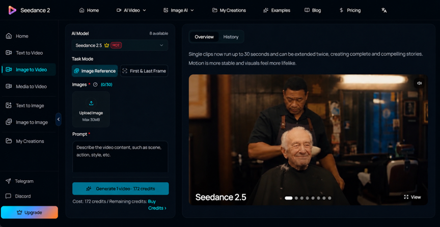
Use image-to-video for exploratory motion when some redraw is acceptable, such as an internal poster mock-up. For public artwork containing exact wording or brand marks, export a text-free background instead and animate that layer. Use a fixed camera with subtle background motion; a camera push conflicts with keeping the original text area stationary.
Copyable prompt
A prompt for a typography-sensitive draft should name the limits as plainly as the motion:
Use the supplied text-free poster background as the reference. Fixed camera and composition. Animate only a subtle light change in the background; keep the central area calm for typography added later. No letters, logos, new objects or morphing.
Instructions like these reduce risk, but they cannot promise perfect font fidelity. Read them as guardrails for the draft, not as a guarantee, and keep the inspection step described below in the schedule even when the first render looks clean.
Trim the accepted background in an external video editor, then overlay the original licensed typography on a separate layer. Extend its on-screen hold in the editor if needed; do not assume native video editing or extension is available for the selected model.
When to composite type
There are two workable approaches, and the difference is who controls the letters.
Whole-poster animation: prepare one finished still; useful for internal mock-ups, but generated glyphs, spacing and logos can drift.
Background animation with original type overlaid: prepare a text-free still and retain the original text layer; preferable when exact wording and brand geometry must remain under editorial control.
Animating the whole poster keeps preparation simple, and for internal mock-ups that may be enough. Compositing takes longer, because the designer generates a clean background plate, then sets the original licensed typography over it in an editor. Prefer the compositing route whenever exact wording, prices, names, or brand marks matter, which in poster work is most of the time. The AI motion then does what it is good at, supplying an animated background, while the designer retains control of the licensed type in a separate layer.
Black Friday Animated Poster Example
For a hypothetical Black Friday poster, use Seedance 2.5 to animate a text-free background with restrained light or texture movement. Then import the accepted clip into a video editor and overlay the original licensed typography. Type the seller-approved offer, campaign dates and conditions there, where every character remains editable. Black Friday is November 27, 2026; the seller must confirm the promotion’s actual schedule and terms. Do not generate a discount inside the background or treat this example as a real offer. Check contrast and phone-size readability, then remove the promotional layer when the campaign ends.
Frame inspection
Before approval, use the checks for your production route, then review the exported clip at full size and phone size:
- A — Whole-poster animation: check AI-generated glyphs against the original, including counters and stroke shapes.
- A — Kerning and spacing: check that letter pairs and word spaces remain consistent across generated frames.
- A — Baseline: check for drift, bounce or waving in generated lines of type.
- A — Logo geometry: reject AI-generated changes to proportions, corners or clear space.
- B — Background plus composited type: verify the original font layer, correct weight and artwork; confirm licensing covers this use.
- B — Contrast and mobile readability: check the original type over the moving background throughout the clip, including the smallest text.
- B — Final export: inspect the rendered file for compression, clipping or scaling that softens or shifts the original text layer.
If any critical type changes, replace that type in post or reject the draft; never publish a poster whose words moved. The honest summary is that generated motion can give a poster depth and a gentle sense of life, and modern tools make a restrained draft quick to produce. The limit is equally clear: consistency of exact letterforms is not guaranteed, so the designer’s eye, not the render, stays in charge of the typography.