
How to Set Readable Captions on a Short Rap Video
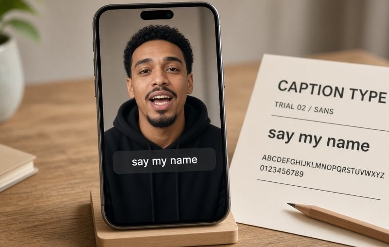
A short rap clip can look sharp on a laptop and still fail on a phone. The beat is fast, the frame is vertical, and a heavy caption can cover the mouth that makes the performance feel personal. Readable captions are a typography job: decide what the text must say, then give those words a small type system that survives movement and a small screen. Do not start with the font. Start with a performance you can actually caption.
Generate the clip before you set type
Captions should match the vocals, not invent a second script. If you still need a source clip, one or two clear, consented, front-facing photos and a short theme can become a lip-synced vertical rap clip. A second photo is optional: add it only when two people should appear together, and only when both have agreed. On Hookai, you pick a scene and write a tight line—the name and one detail the room will recognize. Pasting a full lyric sheet or uploading your own track is planned; it is not required for the first cut.
Treat that file as footage, not a finished post. Watch it once for faces, once for what the voice actually says, and once for empty space where type can sit. If a likeness is weak or a line is wrong, change the photo or the theme and generate again. Do not use typography to hide a problem in the performance.
Give the text one job at a time
Separate three roles: the occasion, the lyric, and a name label. An opening title can name the birthday or club intro. Captions carry the words being performed. A name label is useful only while the viewer still needs it. If all three stay on screen for the whole clip, they compete with the faces. Highlights can punch a line, but they are not a transcript. If the clip needs complete captions, keep the words and fix timing or line breaks instead of quietly dropping the hard parts.
Build a small type system that survives motion
Test the actual words at phone size: the longest name, any accent, and the densest line. Start with a moderately heavy sans-serif whose a, e and s stay open after compression. A display face can work for a two-word title; it should not become the lyric font. Check the licence for video and social use—a free download is not automatically cleared for every export.
Keep the system small: one caption family, one title style, one optional emphasis colour. Prefer a single dark panel or a restrained outline over stacked shadows. Park captions away from mouths and hands, and leave room for the destination app’s interface. If a line only fits after shrinking the type, break it or give it a longer beat. Time phrases to meaning, not to every drum hit, and watch at normal speed—muted first, then with audio.
Approve the export on a phone: faces stay visible, captions match the vocals, and the occasion is clear with the sound off. A short rap video does not need louder type. It needs captions that can be read at arm’s length, without covering the face the clip was made to show.