
Choosing Fonts for Laser Engraving
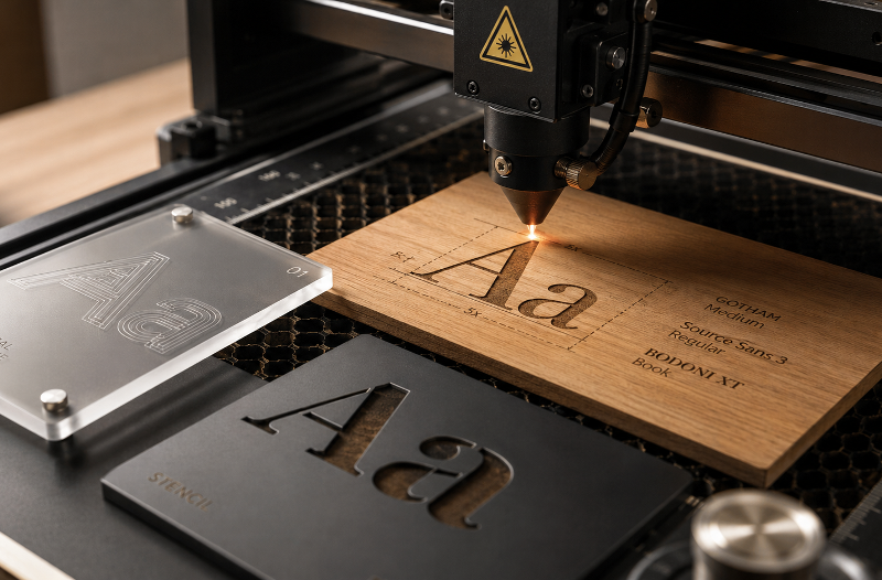
Type behaves differently when a beam burns it into a physical surface. Hairlines vanish, counters fall out, and a whole category of fonts exists that has no outlines at all.
Most typographic decisions assume the letterform will be rendered on a screen or printed with ink. Laser engraving breaks several of those assumptions at once. The type is burned or cut into a material, the machine follows paths rather than filling pixels, and the material itself resists in ways paper never does.
The result is that fonts which look excellent in a layout can fail completely on wood, acrylic, or anodised aluminium. Understanding why makes the selection process much simpler.
Outlines Versus Strokes
The first thing to understand is that a laser does not know what a letter is. It follows vector paths, and how it treats those paths depends on the job setting.
A conventional TrueType or OpenType font describes each glyph as a closed outline. When engraving, the machine fills the interior of that outline by rastering back and forth, which is why a page of text can take several minutes to engrave. When cutting, it traces the outline itself, which produces a letter-shaped hole rather than a letter.
This distinction catches people out constantly. Set a word to cut rather than engrave and you will get the negative of what you expected.
The Case for Single-Line Fonts
There is an entire category of typeface built for exactly this problem. Single-line fonts, also called single-stroke, monoline, stick, or engraving fonts, describe each glyph as an open path with no enclosed area at all. The machine traces the skeleton of the letter in one pass rather than filling a shape.
The best-known examples are the Hershey fonts, a collection of vector typefaces developed around 1967 by Dr Allen Vincent Hershey, a mathematical physicist at the US Naval Weapons Laboratory in Dahlgren, Virginia. They were designed to render text on early cathode ray tube displays, with curves decomposed into connected straight line segments on a coarse grid. Because the data is nothing more than a series of coordinates joined by lines, the fonts scale and rotate freely, which is why they migrated from vector displays and pen plotters into CAD, CNC, and eventually laser engraving. They remain publicly available with few usage restrictions.
Practically, single-line fonts are dramatically faster to engrave than filled outlines, and they produce a clean, uniform line weight that suits technical marking, serial numbers, and fine detail. The tradeoff is aesthetic: they have no weight variation and no stroke contrast, so they look engineered rather than typographic. For a nameplate or a control panel, that is exactly right. For a decorative sign, it usually is not.
Why Hairlines Disappear
The most common failure with ordinary fonts is a thin stroke that simply does not survive the process.
A laser beam has physical width, and the material reacts around the point of contact. On wood the surrounding area chars slightly, on acrylic the edge melts, and on coated metal the mark spreads a little into the coating. A stroke thinner than the effective mark width does not become a thin stroke. It becomes an inconsistent one, or it merges with its neighbour, or it vanishes.
This is why high-contrast Didone faces, thin and hairline weights, and delicate script fonts perform poorly at anything below generous sizes. The thick stems engrave cleanly and the hairlines break up, so the letterform loses the very contrast that defined it. The safest choices are typefaces with relatively even stroke weight and enough mass in the thinnest part of the letter to survive the burn.
Counters, Bridges, and the Stencil Problem
Cutting through material introduces a constraint that engraving does not. Any enclosed counter, the hole in an O, the triangle in an A, the bowl of a P, is a separate island of material. Cut the outline and it falls out.
This is precisely the problem stencil typefaces were invented to solve. Stencil designs build bridges into the letterform, small breaks that connect the counter to the surrounding material so nothing detaches. For cut-through signage, letters, and lettering that must hold together as a single piece, a stencil face is not a stylistic choice but a structural requirement.
The same logic applies to connected scripts. A flowing script cut from a single sheet holds together beautifully, because the letters connect, but the enclosed loops in letters like e, a, and o still need attention.
Size, Spacing, and Legibility
Small engraved text needs more room than small printed text. Because the mark spreads slightly, tight letter spacing that looks refined on screen can cause adjacent strokes to bleed into each other, particularly on wood and leather where charring extends beyond the cut line.
Loosening tracking slightly for small engraved text is almost always an improvement. So is choosing a face with open apertures and generous counters, since narrow gaps close up first. Condensed faces, tight scripts, and anything with very small counters will lose definition before a more open design does.
For very small text, such as serial numbers or fine product marking, a single-line font at a modest size will usually outperform a beautifully drawn outline face, because there is no fill to blur.
Matching the Face to the Material
Materials differ enough that the same font can behave in three different ways.
Wood chars, so contrast comes from the burn itself and grain interferes with fine detail. Medium to bold weights read best, and open-grained timbers punish small type. Acrylic engraves as a frosted mark against a clear or coloured body, which holds detail well and tolerates lighter weights. Anodised aluminium and coated metals produce sharp, high-contrast marks and are the most forgiving surface for fine typography. Leather and paper char and scorch readily, so restraint with weight and size pays off.
Machine capability matters too. Beam quality and the precision of the motion system determine how small a mark stays crisp, which is why laser engraving machines built around RF-excited tubes hold fine typographic detail better than cheaper systems. The font is only half the equation; the other half is whether the hardware can reproduce it.
A Practical Shortlist
For most engraving work, grotesque and neo-grotesque sans faces in regular to bold weights are the reliable default. They have even stroke weight, open counters, and enough mass to survive on any material. Slab serifs work well for the same reason, since the serifs are substantial rather than delicate. Geometric sans faces engrave cleanly and suit modern signage.
Approach with caution: high-contrast serifs, hairline and thin weights, fine scripts, heavily condensed faces, and anything with decorative detail below the effective mark width. None are impossible, but all need to be scaled up considerably to work.
Reach for single-line fonts when speed matters, when the text is small, or when the aesthetic is technical rather than decorative.
Test Before You Commit
The one habit that separates good engraved typography from disappointing engraved typography is testing. Materials vary between batches, settings drift, and the difference between a crisp letterform and a muddy one is often a matter of a small adjustment in power or speed.
Running a scrap test with the chosen face at the intended size, before committing to a finished piece, takes a few minutes and answers questions no amount of on-screen judgement can. Type that has to survive a physical process is best evaluated physically.