
How to Make a Motion Poster with Seedance 2.5 and Keep Text Sharp
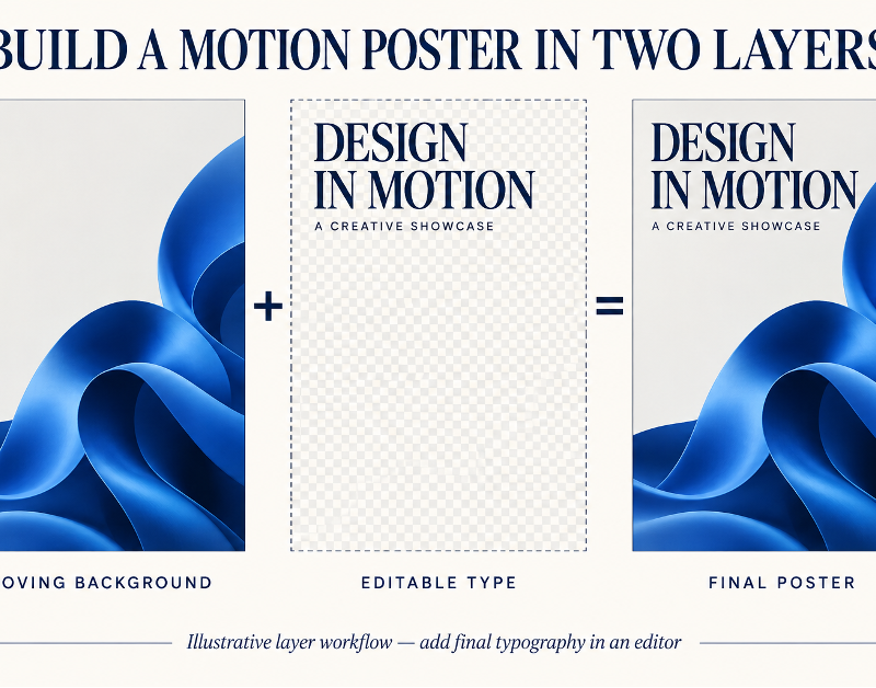
An animated poster or AI motion poster can lose its impact when the headline bends, flickers, or changes between frames. The problem often comes from asking one generated video to do two different jobs: create an atmospheric moving image and reproduce exact motion poster typography. The more reliable method is to separate those jobs.
Create a Seedance 2.5 motion poster in two layers: a moving background and editable typography added afterward. Plan the empty text area before generating so the headline stays readable throughout the animation.
Design the still poster first
Begin with the information the poster must communicate. Decide which line is the headline, what secondary details are necessary, and where a logo or call to action belongs. Build a simple static layout before generating motion.
The background image should provide a subject and atmosphere without occupying every part of the frame. Identify a negative-space area for the headline. A dark wall, open sky, soft gradient, or out-of-focus surface can support text better than a detailed face, patterned clothing, or bright object.
Choose a composition that remains useful when cropped for the intended format. If the motion poster will appear vertically, keep essential content clear of the platform’s interface overlays and leave sufficient room for the title.
Generate only the moving layer
Ask for restrained motion that does not constantly change the contrast behind the text. Examples include drifting fog, a slow light sweep, subtle fabric movement, distant rain, or a gentle camera push. The subject can move slightly, but it should not cross the planned headline area.
When using Seedance 2.5, describe the empty area as part of the composition:
Create a vertical motion-poster background with a cobalt-blue ribbon sculpture in the lower-right area against a pale warm-gray background. Let the ribbon turn slowly while the camera stays still. Leave the upper-left area empty and evenly lit for a dark headline added later. Keep the moving shape and its shadow out of that text area. Include no words, letters, logos, or signs.
This gives the generated layer a clear design role. It also avoids relying on unstable embedded lettering.
Control contrast behind the headline
Text remains readable when the area behind it has predictable brightness and detail. Watch the full background clip, not just the first frame. A passing light or moving object may reduce contrast halfway through the animation.
If the background changes, use a subtle color grade or mask to keep the text area stable. The goal is not to create a heavy box around the title. It is to ensure that the letterforms remain distinct in every frame.
Test the poster at the actual viewing size. Thin strokes that look elegant on a large monitor may disappear on a phone. Small dates and credits need enough size, weight, and spacing to remain legible.
Add typography in post-production
Use the approved font files and write the exact final wording in an editor. Keep the main headline on as few lines as practical. Secondary information should be clearly subordinate, not squeezed into the remaining space.
If the text needs motion, use a simple entrance or opacity change. Complex letter-by-letter effects can compete with the background and make reading slower. Keep the headline stable long enough to read before the poster loops or ends.
Add logos as clean vector or high-resolution assets. Check minimum size, clear space, and color requirements. Do not expect a generated approximation of a logo to meet brand standards.
Review the two layers together
Use this final check:
- The background contains no accidental letters or logo-like marks.
- The planned negative space remains clear throughout the clip.
- The headline has sufficient contrast in every frame.
- Typeface, spelling, capitalization, and line breaks are correct.
- Small supporting text is readable at mobile size.
- The moving subject never passes behind essential wording.
- Motion is restrained enough that the poster can still be scanned quickly.
- The first and final frames work if the platform uses either as a preview.
- The loop, if used, does not create a distracting jump behind the text.
If the typography is wrong, fix the text layer. If the background repeatedly interferes with the headline area, revise or regenerate the moving layer.
A strong AI motion poster behaves like a designed poster that happens to move. By separating background generation from typography, the visual can remain expressive while every word stays exact, readable, and easy to update.
Save a clean background loop and an editable typography layer. A date change or translated headline can then be handled in the editor without regenerating the background.
When making alternate sizes, reposition the layers instead of simply scaling the finished composition. A headline that works in a vertical poster may become too small in a square crop, while the moving subject may enter the text area. Treat each format as a controlled adaptation built from the same background and type assets.
Proof every export from beginning to end; do not assume that a correct design file guarantees a correct rendered video.