
How to Match Website Fonts With Your Restaurant Style
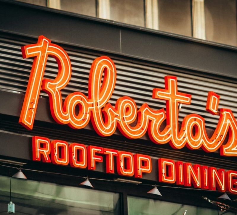
Typography can make a restaurant website feel connected to the dining room or completely detached from it. A visitor may not consciously identify a serif, geometric sans-serif, or condensed display face, but they will notice the mood those choices create. Fonts signal whether a restaurant feels formal, relaxed, traditional, youthful, expensive, familiar, or experimental. They also shape how quickly guests can scan a menu, find opening hours, understand prices, and book a table.
A strong restaurant website treats typography as part of the brand rather than decoration added near the end of the design process. The type should reflect the same character found in the interior, food, service style, packaging, signage, and photography. A small neighborhood bakery needs a different typographic voice from a tasting-menu restaurant, while a late-night cocktail bar should not resemble a family pizzeria online unless that contrast is intentional.
Choosing fonts for restaurant websites therefore requires two kinds of judgment. Designers must understand how type works on screens, and they must understand how the physical restaurant communicates. The best result joins those areas. It gives the website enough personality to feel specific while keeping every practical detail clear.
Typography Should Extend the Dining Room
A restaurant website should prepare guests for the place they are about to enter. Typography plays a central role because it sets expectations before the visitor reads much text. A refined serif with generous spacing may suggest quiet service and careful presentation. A bold condensed sans-serif may suggest speed, energy, and high turnover. A hand-drawn face may feel warm and personal, but it can also seem amateurish when used without control.
The physical space offers the clearest starting point for selecting type. Look closely at the materials, colors, lighting, furniture, artwork, tableware, and signage. A room built around dark wood, brass, linen, and soft light may support a type system with contrast, restraint, and classical proportions. A bright counter-service concept with stainless steel, tile, and an open kitchen may suit cleaner, stronger, and more direct letterforms.
The relationship does not need to be literal. A website for a restaurant with curved arches does not need rounded letters everywhere. A seafood restaurant does not need a script font that imitates waves. The better approach is to identify shared qualities. Curved architecture may suggest softness. Raw concrete may suggest weight and simplicity. Handmade ceramics may support slightly irregular forms. The font should echo the character of the space without turning the website into a visual costume.
The restaurant’s operating model also affects typography. Fast-casual restaurants need quick scanning, bold calls to action, and clear menu categories. Fine-dining websites can use more breathing room and stronger editorial pacing, although reservations and practical information must remain obvious. Cafés often need warmth and familiarity, while bars may need a dramatic display style that still works with low-light photography and mobile screens.
The target customer matters as much as the concept. A restaurant serving professionals at lunch may need speed and clarity even if the interior feels premium. A family restaurant can use friendly forms without becoming childish. A restaurant aimed at tourists may need strong multilingual support, visible location details, and fonts with broad character sets. A local tasting room may place more emphasis on storytelling, provenance, and editorial presentation.
The average check provides another useful signal. Higher-priced restaurants often rely on restraint rather than visual volume. Smaller type, careful spacing, and limited color can support a controlled impression. Lower-priced concepts usually benefit from stronger scale, direct labels, and visible value cues. Price level does not dictate a font category, but it should influence weight, spacing, hierarchy, and tone.
The service style adds further direction. Formal table service may support elegant types with measured spacing. Counter ordering may call for stronger labels and compact information. Shared-plate restaurants often need clear menu structures because guests compare several dishes at once. Restaurants with long wine lists need fonts that handle numbers, accents, and dense text without tiring the reader.
Before opening a font library, define the restaurant in specific terms. Replace broad words such as “modern” or “premium” with clearer descriptions. “Quiet, seasonal, precise, and local” gives more direction than “upscale.” “Fast, colorful, social, and urban” suggests a different system from “warm, handmade, nostalgic, and neighborhood-focused.” Three to five precise brand traits are usually enough.
A simple typography brief can prevent weak choices later. The brief should state the restaurant type, target customer, price level, interior qualities, tone, content needs, and technical limits. It should also identify what the restaurant is not. A modern wine bar may want to avoid rustic scripts. A heritage steakhouse may want tradition without looking old-fashioned. These exclusions narrow the search and reduce dependence on trends.
The website should also connect with existing brand assets. Review the logo, printed menu, exterior sign, takeaway packaging, and social media templates. Some restaurants already have a strong typographic system but use it inconsistently online. Others have a logo that works only at large sizes and need supporting fonts that carry the same tone more clearly. The goal is not to duplicate every physical touchpoint but to create one recognizable voice across them.
Choose a Primary Font That Carries the Brand
The primary font usually handles the strongest moments on the website. It may appear in hero headlines, section titles, menu categories, promotional banners, or key brand statements. This font carries much of the restaurant’s personality, so it deserves more attention than the neutral body face supporting it.
Serif fonts often suit restaurants that want depth, tradition, craft, or editorial character. Their small finishing strokes can create a sense of structure and history. High-contrast serifs, with a clear difference between thick and thin strokes, often feel more formal. Low-contrast serifs can feel warmer, sturdier, and easier to use across menus, labels, and longer text.
Sans-serif fonts tend to feel direct and contemporary, but the category is broad. Geometric sans-serifs use simple circles and clean construction, which can feel controlled and modern. Humanist sans-serifs include more varied shapes and often feel friendlier. Grotesque sans-serifs can look blunt, urban, and practical. Rounded sans-serifs may suit casual concepts, though too much softness can weaken a serious brand.
Script fonts can add personality, but they require restraint. They work best as accents in logos, short headings, signatures, or special labels. Long menu descriptions, reservation instructions, and navigation should rarely use scripts because connected letters slow reading. A script that feels handcrafted in print may also become thin, crowded, or unclear on small screens.
Display fonts are designed for attention rather than extended reading. They may be narrow, wide, decorative, irregular, or heavily stylized. Restaurants often use them well in hero areas or seasonal campaigns. Problems begin when the same font appears in every heading, label, button, and menu item. A strong display type needs a quieter partner and enough space around it.
Handwritten fonts can support bakeries, cafés, food trucks, and small independent concepts, but they should reflect the actual brand. A font that resembles chalk writing may fit a casual coffee counter but clash with polished marble interiors. Handwritten type also varies greatly in quality. Some fonts feel natural; others look like software trying to imitate personality.
Fine-dining restaurants often benefit from disciplined typography rather than ornate type. A sharp serif, restrained grotesque, or custom wordmark may work better than flourishes. The design can signal refinement through scale, spacing, rhythm, and photography. Thin strokes need careful testing because they can disappear over images or on lower-quality screens.
Cafés and bakeries usually need warmth, legibility, and approachability. Soft serifs, humanist sans-serifs, and simple handwritten accents can work well. The typography should support menu boards, opening hours, takeaway details, and frequent updates. A charming headline font loses value when staff cannot use it consistently across printed and digital materials.
Fast-casual restaurants need speed. Bold weights, short labels, strong hierarchy, and clean numerals help users make decisions quickly. The primary font can be distinctive, but the supporting system should remain direct. Mobile ordering, location selection, loyalty prompts, and menu customization create many practical demands that decorative fonts cannot handle alone.
Bars and nightlife venues can support more dramatic typography. Condensed display fonts, sharp sans-serifs, or editorial serifs may work well with dark backgrounds and high-contrast photography. The type still needs enough weight to survive low brightness and image overlays. Reservation buttons, event times, and addresses should remain simple.
Heritage restaurants should avoid turning history into imitation. Old-style serifs, archival lettering, and traditional proportions can suggest continuity, but fake distressing, exaggerated ornament, and period clichés often look theatrical. A better system combines one historically informed typeface with a clean supporting font and modern spacing.
Contemporary restaurants can use unusual fonts, but novelty should serve the concept. A geometric display face may fit a design-led concept with strong interiors. A highly experimental font may suit a chef-driven brand with an artistic audience. The website still needs a stable base for menus, policies, and practical information.
The primary font must also perform technically. Check whether it includes the needed weights, italics, numerals, punctuation, symbols, and language support. Restaurants often use currency signs, fractions, allergens, accented dish names, and multilingual content. Missing characters force awkward substitutions that weaken the design.
Numerals deserve special attention because restaurant websites use them constantly. Prices, opening hours, phone numbers, addresses, dates, and party sizes must read clearly. Check whether the font distinguishes 1, 7, and I, whether zero is clear, and whether tabular numerals are available for aligned prices. Decorative numerals may look attractive in a headline but create confusion in a menu.
Lowercase letters also reveal whether a font can support real content. Examine the shapes of a, g, e, r, and s. Look for tight counters, unusual terminals, or forms that become unclear at small sizes. A font may look impressive in uppercase but fail when used for dish names, descriptions, or reservation notes.
Font families with several weights provide more control. Regular, medium, semibold, bold, and italics allow the design to build hierarchy without adding more typefaces. Too many weights can create inconsistency, but too few may force the designer to rely on size alone. A family with a practical range usually produces a more stable system.
Web performance should influence the choice early. Every font file adds loading time, especially when the design includes several weights and styles. Variable fonts can reduce file count while providing a broad range of weight and width, although browser testing remains important. A restaurant website should not delay menu access or reservations because of typography.
Licensing also matters. Some fonts permit desktop use but require a separate web license. Others limit page views or domains. Restaurant groups need to confirm whether one license covers multiple locations, regional websites, or franchise pages. Free fonts can work well, but they still need proper review for quality, support, and consistency.
The primary font should be tested with actual restaurant content before approval. Use real dish names, long ingredients, prices, chef names, addresses, and booking messages. Placeholder text hides problems because it lacks the unusual lengths, accents, and numerical patterns found in real menus.
Novelty should never be the main reason to select a font. A font that looks fresh today may feel dated once many restaurants adopt it. The better question is whether the type reflects this restaurant’s character and remains useful across several years, devices, campaigns, and menu changes.
Pair Fonts Through Role, Contrast, and Structure
A useful font pairing begins with clearly assigned roles. One typeface may carry personality in headlines, while another handles body text, menus, forms, and practical details. Without defined roles, designers often switch fonts based on instinct from one section to another. The result feels inconsistent even when both fonts look attractive individually.
Most restaurant websites need only two typefaces. A third may be justified for a logo, special campaign, or limited handwritten accent, but it should not become another general-purpose choice. Two well-managed families usually provide enough variety through weight, size, case, spacing, and italics.
The headline font should establish identity. It can be expressive, narrow, dramatic, elegant, or unconventional because visitors see it in short bursts. The supporting font should prioritize clarity. It must handle paragraphs, menu descriptions, allergen notes, addresses, forms, and booking instructions without demanding attention.
Contrast creates a stronger pairing than near similarity. A serif headline paired with a sans-serif body font gives each typeface a clear job. A narrow display face can work with a wider, open sans-serif. A heavy headline font can sit above lighter body text. A formal serif may pair with a neutral grotesque that prevents the design from feeling overly ceremonial.
Two similar fonts often create more conflict than two contrasting ones. Pairing two geometric sans-serifs, for example, can look like a mistake because their small differences remain visible without serving a purpose. The reader senses inconsistency but cannot identify a useful hierarchy. Choosing one family or creating greater contrast usually solves the problem.
Strong contrast still needs a shared visual detail. Fonts may differ in category while sharing proportions, curves, stroke endings, or overall width. A serif and sans-serif with similar x-heights often align comfortably. Two fonts influenced by the same historical period may also feel connected despite obvious differences.
X-height has a major effect on pairing. Fonts with a large x-height appear bigger and more direct at the same nominal size. Fonts with a small x-height can feel refined but may require larger settings. When paired fonts have radically different x-heights, headings and body text may look disconnected unless their sizes receive careful adjustment.
Letter width also affects rhythm. A condensed headline can create a strong impact above a moderately wide body font. Pairing two very wide fonts may consume too much space, especially on mobile screens. Pairing two condensed fonts may make the page feel tense and crowded. Width should support the pace of the restaurant and the amount of information presented.
Stroke contrast influences tone. A high-contrast serif with thin hairlines may pair well with a clean sans-serif that has moderate stroke variation. A heavy slab serif may work with a lighter humanist sans-serif. Two fonts with highly dramatic stroke patterns may compete, particularly when both appear at large sizes.
One reliable approach uses elegant serif headings with a neutral sans-serif body. This system suits fine dining, wine bars, chef-led concepts, and restaurants with editorial photography. The serif supplies character, while the sans-serif keeps menus and booking information readable.
Another useful approach combines bold condensed headings with an open sans-serif. This pairing works for busy casual restaurants, burger concepts, bars, and urban cafés. The condensed font saves horizontal space and creates energy. The wider supporting font gives descriptions and practical information room to breathe.
A softer combination pairs a humanist sans-serif with a traditional serif. The sans-serif can handle friendly headings, navigation, and calls to action, while the serif supports storytelling or menu descriptions. This approach suits neighborhood restaurants, bakeries, farm-focused concepts, and hospitality brands that want warmth without using handwriting.
A display font paired with a restrained sans-serif works when the brand needs a strong visual signature. The display face might appear only in the main headline, selected category names, or campaign graphics. Limiting its use makes each appearance more valuable and prevents the site from becoming exhausting.
A single-family system can also work. One font family with several weights, widths, or optical sizes may create enough distinction for the whole website. This approach suits minimalist restaurants, multi-location brands, and sites with complex ordering systems. Consistency becomes easier, and fewer files can improve loading speed.
Pairing mistakes often start with two fonts that both demand attention. An ornate script and decorative serif may each look appealing alone, but together they compete for control. The page lacks a visual resting point. At least one typeface should remain quiet enough to support content.
Overusing uppercase creates another common problem. Uppercase can work for navigation, short labels, and menu categories, but long uppercase headings slow reading and occupy more width. Excessive letter spacing may add a premium tone in small doses, yet widely spaced mobile labels can wrap into awkward shapes.
Weight should support hierarchy rather than replace it. Designers sometimes set every important item in bold, leaving no distinction between a menu heading, dish name, button, and alert. A better hierarchy uses scale, spacing, position, and weight together. Semibold may be enough for dish names, while bold remains available for primary actions.
Font pairing should also account for restaurant tables, signage, menus, and packaging already visible in photography. If printed menus use a strong serif and the website introduces two unrelated display fonts, the brand begins to fragment. The digital system does not need to copy the printed one exactly, but the relationship should be understandable.
Connect Website Type With the Physical Restaurant
The strongest restaurant brands repeat recognizable visual ideas across physical and digital settings. Exterior signs, printed menus, uniforms, packaging, reservation emails, and social media do not need identical typography, but they should appear to come from the same place. Consistent proportions, spacing, capitalization, and tone can provide continuity even when production needs require different fonts.
Interior materials can guide typographic details. Marble and brass may support precise spacing, sharper contrast, and restrained headings. Reclaimed wood may suit warmer letterforms with less rigid geometry. Stainless steel and exposed services may support condensed, industrial, or utilitarian types. Soft upholstery and curved lighting may work with rounder forms and gentler spacing.
Furniture also affects the perceived pace of a room. Closely arranged communal seating suggests energy and movement, while widely spaced upholstered seating suggests privacy and longer meals. Typography can reflect that pace. Compact headings and bold labels feel active. Larger margins, slower transitions, and carefully spaced serif text feel more measured.
Color changes how a font behaves. Thin serif text may look elegant in dark ink on a pale background but disappear in white over a dim photograph. Heavy sans-serif type can appear controlled in black but aggressive in a bright red or orange. Font selection should therefore happen alongside color and imagery rather than in isolation.
Photography has a particularly strong effect on type. Food images contain irregular shapes, highlights, plates, garnishes, and shadows. Interior images include lights, windows, furniture, and people. Headlines placed directly over these scenes need enough weight and contrast to remain readable. Designers should first adjust image selection, cropping, overlays, and placement instead of automatically choosing heavier types.
Quiet photography can support more expressive typography. A simple image of one dish against a neutral background leaves space for a distinctive headline. Busy event photography usually needs a calmer type and a controlled text area. Type and imagery should divide attention rather than compete for it.
Printed menus create another useful reference, but direct copying rarely works. A font that looks clear on textured paper under restaurant lighting may become weak on a phone. Fine hairlines, tiny capitals, and wide tracking can fail at narrow widths. Digital typography may need heavier weights, larger text, shorter line lengths, and simplified spacing.
The website should preserve the printed menu’s mood rather than every detail. A delicate menu serif might remain in large category headings while a sturdier related serif handles dish descriptions online. Decorative borders can become spacing rules. Small-cap labels can become semibold sans-serif text. The adaptation should respect the brand while responding to the screen.
Signage presents similar limits. A custom sign may use modified letters that do not exist as a complete font. Designers should not force the logo type into body copy. Instead, they can find a supporting family with related proportions, stroke shapes, or historical references. The logo remains distinctive, while the website gains a practical working system.
Multilingual restaurants need additional care. A font may support English but lack Czech, French, Vietnamese, Greek, Hebrew, or Arabic characters. Automatic fallback fonts can produce visible changes in weight and width within the same line. Language support must be checked before the design reaches development.
Right-to-left languages require more than character coverage. Layout, alignment, punctuation, navigation order, and interface components may need adjustment. Some pairings that work well in Latin scripts have no convincing equivalent in another script. The brand may need companion fonts selected specifically for each writing system.
Accessibility should remain part of the visual decision. Body text needs sufficient size, line spacing, and contrast. Thin fonts, tight line height, and long centered paragraphs create unnecessary difficulty. Menu information should remain readable for older visitors, users with reduced vision, and people viewing the site in bright sunlight.
Buttons need direct labels and strong contrast. “Reserve,” “Order Online,” “View Menu,” and “Get Directions” should not disappear inside decorative typography. A visitor should identify the primary action within seconds. The brand font can support the interface, but it should never obstruct the task.
Test the System With Real Content
A typography system becomes useful only after it survives real restaurant content. Designers should test short dish names, long dish names, ingredients, dietary labels, prices, opening hours, chef biographies, policies, and reservation errors. Each content type creates different pressures.
Mobile testing should begin early rather than after desktop approval. Restaurant traffic often comes from people searching while traveling, walking, or deciding where to eat. Narrow screens reveal whether headings wrap badly, prices separate from dish names, buttons become too tall, or navigation labels no longer fit.
Menu pages need especially careful testing. Dish names should remain easy to distinguish from descriptions and prices. Prices should align consistently without appearing detached. Dietary symbols should remain recognizable. Long descriptions need comfortable line lengths, while category headings need enough separation to help users scan.
Real devices reveal problems that design software misses. Font rendering varies between operating systems, browsers, and screen densities. Thin strokes may look weak on one device and heavy on another. Letter spacing may appear different after the browser loads the actual font. Testing should include common phones, laptops, and at least one lower-resolution display.
Loading behavior also deserves attention. A temporary fallback font can shift line breaks, move buttons, and change page height before the chosen font appears. Developers can reduce this movement by selecting compatible fallbacks, preloading critical files, and using font-display settings carefully. The first screen should remain usable even before every asset finishes loading.
A practical style guide should record the final decisions. It should define headline sizes, body sizes, weights, line heights, letter spacing, capitalization, colors, and approved combinations. It should also show treatments for menu categories, dish names, prices, buttons, captions, forms, and alerts.
Responsive rules should be included in the guide. A desktop hero heading may use 72 pixels, while the mobile version needs 38 pixels and tighter line height. Menu text may remain the same size across devices but use narrower margins. Navigation labels may switch from text links to a compact menu without changing the underlying typographic voice.
The guide should limit improvisation. Staff members and outside agencies often create seasonal menus, event pages, delivery graphics, and promotional banners. Clear rules help them extend the brand without introducing random fonts. Approved alternatives can be listed for office documents or tools that do not support the main web fonts.
The final system should feel natural rather than visibly designed. Guests should notice the restaurant’s character, understand the menu, and complete practical actions without studying the typography itself. Strong font choices support the food, interior, service, and story while remaining clear enough to disappear into the task.
A successful restaurant website does not select a type because it looks fashionable in a design gallery. It selects type because the letters belong beside the restaurant’s dishes, materials, lighting, prices, and people. When the pairing matches both the culinary identity and the demands of the screen, the digital visit becomes a credible introduction to the meal that follows.