
How Typography Shapes Messaging Apps: Readability, Multilingual Design and Desktop UX
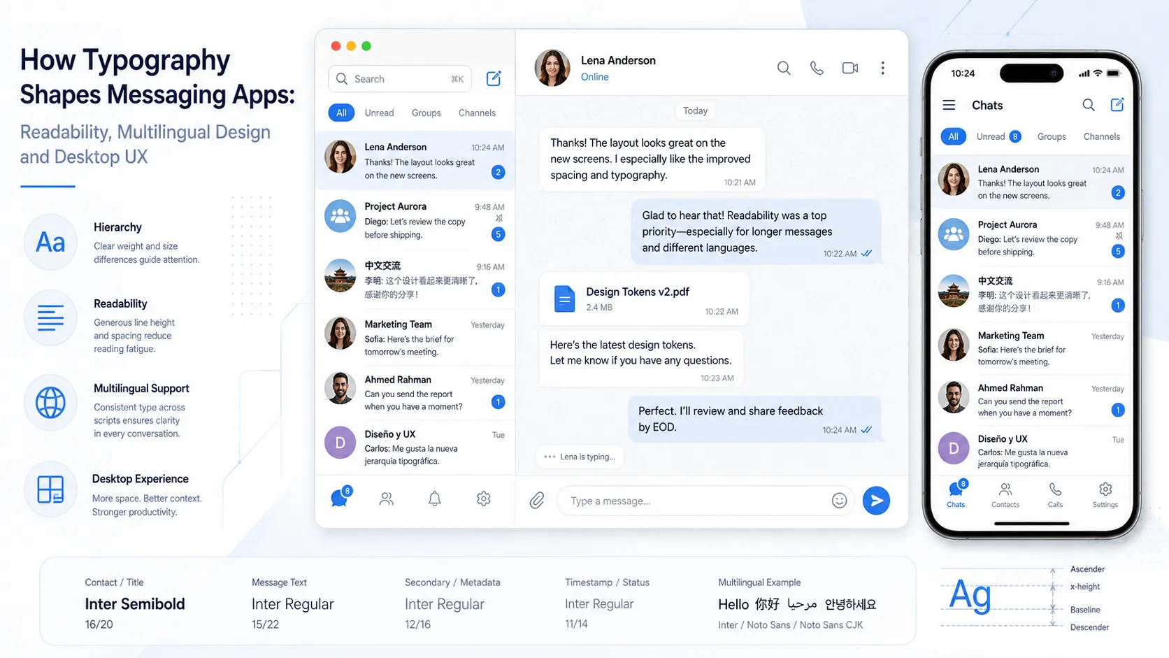
Messaging interface typography: hierarchy, readability, multilingual support, and desktop UX.
Messaging applications are among the most text-heavy digital products people use every day. A typical interface may contain contact names, timestamps, notifications, short replies, long conversations, filenames, system messages, emojis, links, and interface controls—all competing for attention within a relatively small space.
Because of this, typography plays a much larger role in messaging UX than it may initially appear.
A good type system helps users scan conversations quickly, distinguish primary information from secondary details, read comfortably across different screen sizes, and move between languages without disrupting the visual hierarchy. Poor typography, by contrast, can make even a well-designed messaging product feel crowded, inconsistent, or difficult to use.
The challenge becomes even greater when a messaging application must work across mobile and desktop environments while supporting multilingual text, Unicode characters, and different operating systems.
Understanding how typography behaves in these situations offers useful lessons not only for messaging products, but for digital interface design more broadly.
Why Typography Matters More in Messaging Interfaces
Messaging interfaces are unusual because users rarely read them in a linear way. Instead, they constantly scan.
A user may look at the conversation list, identify an unread message, glance at the sender name, check the time, read a few lines, open an attachment, and then return to another conversation within seconds.
Typography has to support this rapid movement.
The interface usually depends on several levels of hierarchy:
- contact or group names;
- message content;
- timestamps;
- unread indicators;
- labels;
- system notifications;
- buttons and navigation items;
- attachment names.
If these elements look too similar, users have to work harder to understand what they are seeing.
Font size, weight, spacing, color, and line height all contribute to hierarchy. A slightly heavier sender name can make conversations easier to scan. A smaller timestamp can remain visible without competing with message content. Consistent line height can make long discussions feel calmer and easier to follow.
The best typography systems make these differences feel natural rather than exaggerated.
Font Size, Line Height and Message Density
Messaging applications face a constant trade-off between readability and information density. If text is too large, a conversation takes up excessive space and users see fewer messages at once. If text is too small, reading becomes uncomfortable, especially during long sessions.
Font Size
The ideal font size depends on several factors: screen size, viewing distance, operating system, display resolution, accessibility settings, and expected message length.
Mobile interfaces generally require careful use of space because the screen is narrow. Desktop interfaces have more room, but increasing font size without considering overall layout can still make sidebars and conversation panels feel inefficient.
Designers should test realistic conversations rather than relying only on short sample text. A layout that looks balanced with two-line messages may behave very differently when users send several paragraphs.
Line Height
Line height is particularly important in messaging. If lines are packed too closely together, long messages become tiring to read. If the spacing is too generous, conversations feel fragmented.
The correct balance depends on the typeface and the size being used. Fonts with larger x-heights may appear more readable at small sizes, while others may need additional vertical space to avoid looking compressed.
Message Density
Dense interfaces are not automatically bad. Professional users, community managers, and people who handle large numbers of conversations may prefer seeing more information at once.
The key is to make density intentional. Messages, timestamps, names, and interface controls should remain visually distinct even when the layout is compact.
Designing for Desktop and Mobile Screens
A messaging interface cannot simply be enlarged or reduced when moving between devices. Mobile and desktop environments create different typography requirements.
Mobile Interfaces
Mobile screens are narrow, so text wraps more frequently. This affects message bubble height, paragraph rhythm, button width, menu labels, attachment previews, and navigation.
Short interface labels become especially important because long text can reduce available space for icons and controls. Touch interaction also requires larger target areas around text-based buttons, even when the text itself remains relatively compact.
Desktop Interfaces
Desktop applications usually have wider layouts. A typical desktop messaging interface may include a navigation column, a conversation list, the active chat, file previews, search tools, and settings panels.
This means typography has to work across several different content zones at once. Users also sit farther from a desktop monitor than from a smartphone, so type that works well on mobile may feel too small on a larger display.
People preparing a messaging environment on a computer may also need to understand platform-specific setup and layout considerations. A Telegram desktop setup resource, for example, can provide context for users working with the desktop version before they begin adjusting their daily workflow.
The broader design principle is that desktop and mobile typography should feel related, but not necessarily identical.
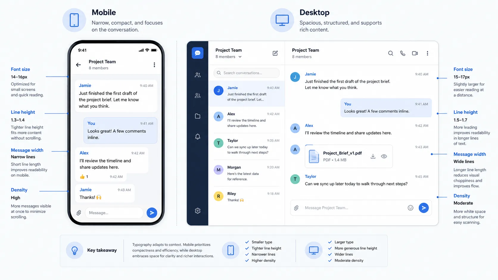
Mobile and desktop interfaces need related typography systems, but different sizing, spacing, and density decisions.
Multilingual Typography Is More Than Translation
Localization is often discussed as a translation task, but interface typography introduces additional challenges.
Different writing systems have different visual characteristics. An English label that fits neatly inside a button may become longer when translated into Spanish or German. Chinese text may require less horizontal space in some cases, but individual characters contain far more visual detail than Latin letters. Arabic introduces different shaping behavior. Japanese may combine kanji, hiragana, katakana, and Latin characters in the same interface.
A multilingual messaging application therefore needs more than translated strings. It needs a type system capable of handling multiple scripts, different character widths, fallback fonts, punctuation, line breaking, vertical spacing, and mixed-language messages.
Chinese Characters and Interface Density
Chinese typography is particularly useful for illustrating why localization cannot be treated as an afterthought.
Chinese characters are visually dense. At small interface sizes, thin strokes may become difficult to distinguish. If line height is too tight, rows of characters can appear crowded. If a fallback font has a different visual weight from the main Latin typeface, mixed English and Chinese text may look inconsistent.
This matters in messaging applications because users often combine Chinese text, English product names, numbers, links, emojis, and file names. Designers need to consider how all of these elements appear together.
Chinese-language resources and localized interfaces also introduce search and navigation terminology that may be unfamiliar to non-Chinese speakers. For example, users may encounter the phrase Telegram 中文版下载 when searching for information related to a Chinese-language Telegram version or localized download guidance.
From a typography perspective, such mixed-script labels are a good reminder that interface systems should be tested with real multilingual content rather than placeholder Latin text.
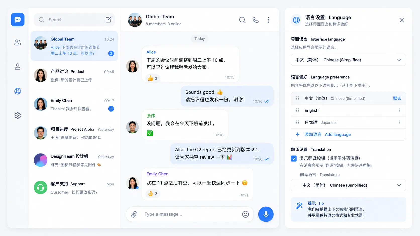
Multilingual messaging UI: mixed Chinese and English content, language preferences, and localization settings.
Font Fallbacks Matter
No single font necessarily contains every character a user may type. That is why operating systems and applications often rely on font fallback chains.
A fallback font is used when the primary typeface does not include a required glyph. This can happen with Chinese characters, Japanese text, Arabic, Cyrillic, mathematical symbols, uncommon Unicode characters, and emoji.
The problem is not simply whether the character appears. The fallback should also feel visually compatible with the rest of the interface.
Differences in x-height, stroke width, character proportions, or baseline alignment can make mixed-font messages look uneven. A carefully planned fallback system helps maintain a consistent visual rhythm.
Common interface systems may rely on platform fonts such as Segoe UI, San Francisco, Roboto, Noto families, or other system-level typefaces depending on the operating system and language environment. The exact font stack can vary, but the principle remains the same: fallback behavior should be tested before launch.
Unicode, Emoji and Mixed-Script Messages
Messaging interfaces must handle a wider range of text than many other software products.
A single message might contain English text, 中文字符, numbers, punctuation, an emoji, a URL, and a filename. All of these elements need to align reasonably well.
Unicode support makes this technically possible, but visual consistency still requires attention.
Emoji Alignment
Emoji may be rendered differently by different operating systems. Their visual height and baseline can also differ from surrounding text. If line spacing is too tight, large emoji can make a message row feel uneven.
URLs and Long Strings
Links introduce another challenge. Unlike normal prose, URLs may contain long unbroken strings. Interfaces need rules for line wrapping so these links do not extend outside message containers.
Numbers and Timestamps
Numbers appear constantly in messaging interfaces. Timestamps, dates, file sizes, verification codes, and message counts should remain easy to scan. Fonts with clear numeral forms can improve readability, especially when several similar characters appear together.
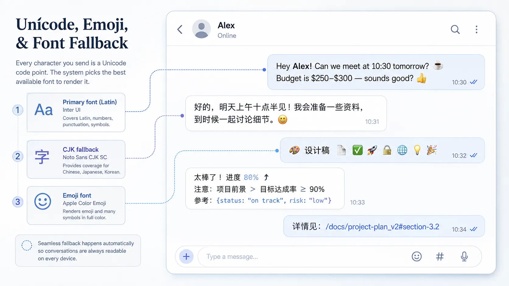
Unicode, emoji, and CJK fallback fonts need to coexist cleanly inside the same messaging interface.
Typography and Accessibility
Accessibility should be part of the type system from the beginning. Users may have different visual needs, device preferences, and reading conditions.
Important considerations include sufficient text size, readable contrast, adjustable scaling, clear hierarchy, adequate spacing, and support for operating-system accessibility settings.
Designers should also avoid relying exclusively on font weight or color to communicate status. For example, an unread conversation might use a combination of weight, indicator icons, and spacing rather than simply changing the text from gray to black.
This provides multiple visual signals and improves usability for a wider range of users.
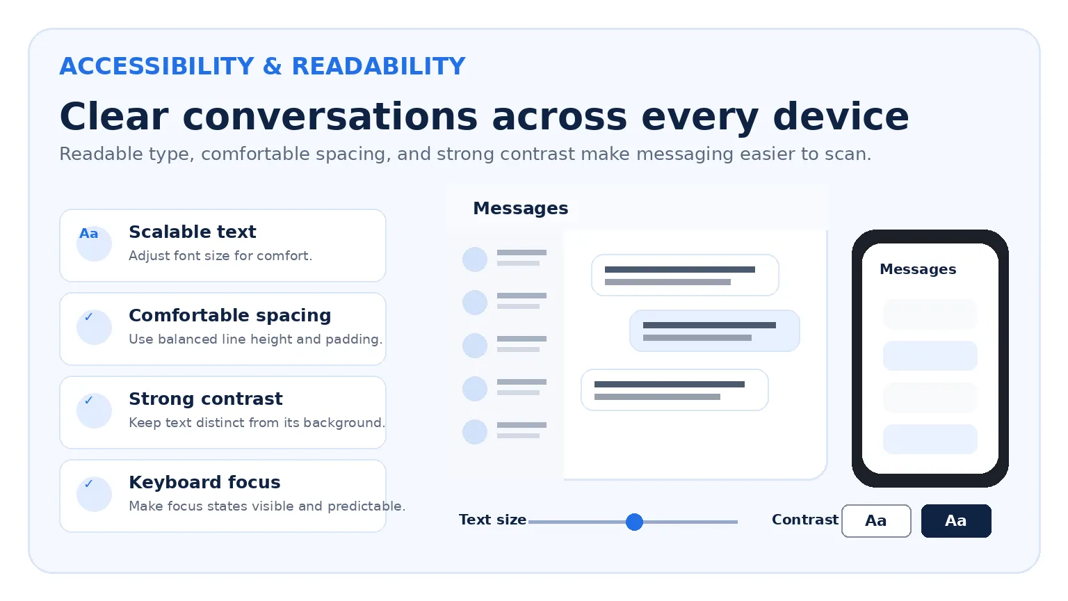
Accessible messaging typography combines scalable type, comfortable spacing, strong contrast, and consistent cross-device hierarchy.
Why Consistency Across Devices Matters
People increasingly expect conversations to follow them from one device to another. A message may be read on a phone, answered on a laptop, and reviewed later on a tablet.
Typography contributes strongly to the feeling that these experiences belong to the same product. Consistency does not mean using exactly the same font size everywhere. Instead, the system should preserve recognizable relationships.
For example, sender names remain more prominent than timestamps; message text remains the primary reading layer; system notifications remain secondary; navigation labels follow a consistent hierarchy; and spacing patterns remain familiar.
The exact dimensions can adapt to each screen while the visual logic remains stable. This is particularly important when mobile and desktop interfaces are developed by different teams. Without a shared type system, small inconsistencies can accumulate quickly.
Typography Should Support, Not Compete With, Conversation
Messaging products are fundamentally about communication. That means the interface should not draw more attention than the messages themselves.
Highly decorative fonts may work in branding, posters, or landing pages, but they are rarely appropriate for long chat sessions. Messaging typography usually benefits from being neutral, predictable, and highly legible.
The goal is not to make every word visually distinctive. The goal is to help users understand who is speaking, what was said, when it was sent, what requires attention, and where to navigate next.
Good typography quietly supports these tasks.
What Designers Can Learn From Messaging Apps
1. Test With Real Content
Placeholder text is not enough. Use long messages, short replies, emojis, links, multiple languages, and file names.
2. Plan Multilingual Support Early
Do not wait until the final localization stage to discover that buttons, menus, or fonts fail with another writing system.
3. Build a Reliable Fallback Strategy
Make sure unsupported glyphs fall back to typefaces that remain visually compatible with the interface.
4. Test Desktop and Mobile Separately
A typography system should be related across devices, but each environment requires its own spacing and sizing decisions.
5. Prioritize Readability Over Personality
Brand identity can still appear through color, icons, spacing, and selected display elements without sacrificing comfortable message reading.
6. Include Accessibility in the Type Scale
Allow the interface to adapt when users increase system font sizes or use display scaling.
7. Consider the Entire Conversation System
Typography includes more than message text. Contact lists, notifications, settings, search results, file previews, and system messages all belong to the same hierarchy.
Conclusion
Typography is one of the most important structural elements in a messaging interface.
It determines how quickly users scan conversations, how comfortably they read long messages, how clearly information is prioritized, and how well the interface adapts to different devices and languages.
The challenge becomes more complex when a product must support both desktop and mobile environments while displaying Latin characters, Chinese text, emoji, URLs, numbers, and other Unicode content within the same conversation.
Successful messaging typography therefore depends on more than choosing an attractive font. It requires careful attention to font size, line height, message density, fallback behavior, localization, accessibility, and cross-device consistency.
When all of these elements work together, users rarely stop to think about the typography. They simply read, respond, and move through the interface naturally.
That invisibility is often the strongest sign that a messaging type system is doing its job well.