
Implementing Custom Fonts in Email Design: Techniques and Best Practices

Designing engaging and aesthetically pleasing email campaigns requires more than great visuals and catchy content. One often overlooked element is the choice of fonts. Implementing custom fonts can significantly enhance the branding and overall impact of your emails. However, incorporating custom fonts in emails has unique challenges, especially around compatibility across different email clients. This guide will walk you through step-by-step techniques for embedding custom fonts in your email design and offer strategies for overcoming common challenges.
1. Why Custom Fonts Matter in Emails
Custom fonts play a pivotal role in brand identity. Using a branded font can make your emails instantly recognizable and help strengthen your connection with subscribers. Around 56% of marketers say that brand consistency in email design leads to higher engagement, making custom fonts worth the effort. A well-chosen font can convey the tone of your message—whether it’s professional, friendly, or playful—thereby ensuring your communication aligns perfectly with your brand.
2. Understanding the Basics of CSS for Custom Fonts
To begin incorporating custom fonts, CSS is your go-to tool. You can embed custom fonts into your email using the @font-face rule in CSS, which allows you to specify which font should be used and where it can be sourced from.
Example Code:

Once declared, you can use font-family: ‘MyCustomFont’; to apply the custom font within your email. Make sure to host your font files on a reliable server to prevent any issues with loading times.
3. Choosing Web-Safe Fonts as Fallbacks
Since not all email clients support custom fonts, it’s essential to use fallback fonts. A fallback strategy ensures that when a custom font isn’t available, a similar system or web-safe font will be displayed instead, providing a consistent user experience.
For example:

This approach ensures your email still looks acceptable even if the custom font cannot load. When choosing fallback fonts, try to pick ones that are visually similar to your custom font to minimize the difference in appearance.
4. Dealing with Compatibility Challenges
One major challenge is that not all email clients support custom fonts. Clients like Apple Mail and some versions of Outlook can handle custom fonts, while others like Gmail do not. To make sure your email design remains intact, always set default web-safe fonts as fallbacks. For example, if Gmail doesn’t support your custom font, setting a consistent fallback font can help maintain a cohesive appearance.
It is also important to note that some mobile clients may have different compatibility than desktop clients, so understanding which email clients your audience uses the most can help you optimize the design effectively.
5. Conditional CSS for Different Clients
Another way to ensure compatibility is by using conditional CSS. Certain email clients allow the use of specific CSS targeting techniques. For example, Microsoft Outlook can be targeted using <!–[if mso]> to make sure a different style is applied to this client. This approach helps you adapt styles for clients that use older rendering engines, like those in Microsoft Office.
Example:
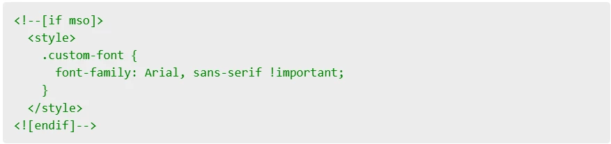
By using conditional CSS, you can adjust your email’s appearance to accommodate Outlook, ensuring a better user experience for subscribers who use this client.
6. Testing Custom Fonts Across Email Clients
Testing is crucial for ensuring that your custom fonts work as intended. You should test your email designs across all major email clients, such as Gmail, Yahoo, Outlook, and Apple Mail, using tools like Litmus or Email on Acid. This will help you identify any compatibility issues early and adjust accordingly. Testing on different devices (desktop, tablet, and mobile) will also give you insight into the email’s performance across screen sizes and platforms, allowing you to make informed design tweaks.
7. Base64 Encoding for Font Embedding
An alternative method for embedding fonts is to use Base64 encoding, which allows you to embed the font directly into your CSS without needing an external URL. This can be a handy solution if you want to improve the deliverability of the font across certain email clients. Base64 encoding essentially converts font files into a long string of text, which is then embedded directly into your email.
Example Code:

While this technique can improve compatibility, it also significantly increases the size of your email. To avoid deliverability issues, use Base64 encoding sparingly and only for critical fonts.
8. Reducing Email Size for Better Deliverability
Custom fonts can increase the overall file size of your emails, potentially affecting load times. To mitigate this, only include the necessary font weights and styles. Additionally, consider using compressed versions of your fonts (such as .woff or .woff2). Keep in mind that more than 65% of users expect emails to load quickly, and oversized fonts can impact this expectation negatively. Keeping the size of your email under 100KB is a good rule of thumb to maintain optimal performance and avoid getting flagged by spam filters.
9. Limiting Custom Fonts to Headings
To ensure consistency and efficient load times, consider limiting custom fonts to headings or call-to-action text. This allows the most important parts of your email to stand out while ensuring that other sections render reliably, regardless of the email client. Body text should use web-safe fonts to ensure readability across all platforms. This also minimizes the impact on email size, allowing you to balance aesthetics with practicality.
10. Consider User Devices
Emails are often opened on mobile devices. When designing with custom fonts, always remember to test on different devices and adjust your CSS to ensure responsive design. A good practice is to use media queries to adjust font sizes, line heights, and styles for smaller screens. For instance:

This ensures that your custom fonts remain legible and visually appealing across devices, providing an optimal experience whether the user is on a smartphone, tablet, or desktop.
11. Best Practices for Choosing Custom Fonts
Choosing the right custom font is about more than aesthetics. Consider fonts that are highly legible, even in smaller sizes. Fonts with distinct letter shapes and adequate spacing tend to be more readable, which is important for ensuring your subscribers can easily understand your message. Additionally, consider accessibility—some fonts are more dyslexia-friendly than others, which could make your emails more accessible to a wider audience.
12. Minimizing the Risk of Rendering Issues
Rendering issues can arise when fonts are not supported or properly loaded by email clients. To minimize this risk, avoid over-relying on custom fonts for critical text. For example, always ensure that key content, such as disclaimers or important call-to-action phrases, uses fallback fonts so that these messages are clearly communicated, regardless of the client. Consistent testing can help identify areas where rendering issues may impact the user experience.
13. Email Client Support Overview
To properly implement custom fonts, it’s crucial to understand which email clients support them. Apple Mail, iOS Mail, and some versions of Outlook support custom fonts. In contrast, popular webmail clients like Gmail and Yahoo tend to block them. Knowing the breakdown of email client usage among your audience can help guide decisions about whether to use custom fonts and how extensively to implement them.
14. Engaging Subscribers with Font Pairing
Font pairing is a useful technique for enhancing the visual appeal of your emails. By pairing a custom font with a reliable fallback, you can create a sense of cohesion and aesthetic interest. For instance, pairing a bold custom font for headers with a simpler sans-serif fallback for body text can create a visually engaging contrast. Around 45% of users state that the readability of an email affects their engagement levels, so making thoughtful font pairing choices is crucial for maintaining user interest.
Bringing It All Together
Embedding custom fonts in email designs adds a distinctive touch, allowing brands to shine and emails to stand out in crowded inboxes. Despite compatibility challenges, careful planning and fallback strategies make it feasible. By using best practices such as providing fallbacks, limiting custom fonts to critical areas, testing across email clients, and using media queries for responsive design, you can create beautiful, brand-consistent email campaigns that leave a lasting impression. Incorporating thoughtful font pairing and focusing on readability ensures that your message resonates effectively with your subscribers.