
Interactive Data Visualization: Typography Best Practices for Web Maps
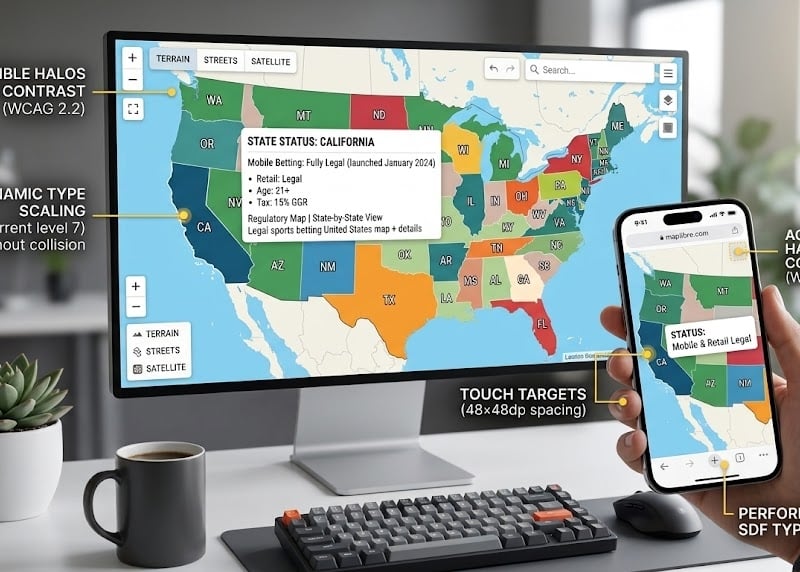
Image Credit – Gemini
The Geographic Density Trap
Web maps operate as the most hostile environments for digital typography on the internet today. The reality is, unlike a standard webpage where text stacks neatly within a fluid CSS document flow, cartographic interfaces demand ruthless absolute spatial positioning. Geographic entities constantly fight for identical screen real estate. Cities, state borders, topographical contours, and complex transit networks must render simultaneously across unpredictable zoom layers. When these expansive data visualizations scale down to accommodate narrow mobile viewport widths, traditional typographic rules evaporate.
Geometric sans-serifs receive endless praise for corporate branding, but drag them onto a multi-layered street grid and they fall apart immediately. Let’s be real—perfectly circular ‘O’s and wide character counters consume horizontal space we simply do not possess. A label overlapping another label is not an aesthetic flaw; it represents a complete failure of the information architecture. Map design necessitates the strict use of narrow, condensed typefaces. A successful cartographic font requires a high x-height to artificially inflate perceived legibility when scaled down to a microscopic ten pixels on a mobile viewport.
You cannot compromise on character distinctness in this environment. Mix up a lowercase ‘l’, a capital ‘I’, and the number ‘1’ on a dense interface and watch your users struggle. That kind of visual ambiguity causes absolute chaos when someone is rushing to parse a tiny administrative code under pressure.
Killing the Static Font File
Developers clinging to static font weights in modern mapping stacks are burning bandwidth for absolutely no reason. Historically, old architecture required separate HTTP requests for every individual static font style. This antiquated method bloated page weight and forced designers to compromise on typographic expression. Variable fonts dominate the current architectural landscape because they solve the spatial scaling crisis entirely.
You drop a single, highly compressed WOFF2 file into the rendering engine, instantly unlocking continuous interpolation across weight, width, and optical size axes. Map libraries now programmatically bind a font’s exact width axis directly to the camera pitch or zoom level. As a user pulls back from a dense city view to a macro regional view, the typography smoothly condenses mathematically. The engine squeezes more labels into the tightening bounding boxes without triggering brutal collision-hiding algorithms. Look closer and you’ll realize this continuous interpolation eliminates the jarring layout shifts caused by swapping old files. We keep the application highly performant and aesthetically unified while radically minimizing the server payload.
The Contrast Dilemma and Halo Mathematics
A dark text label dropped over a chaotic, multi-colored vector tile background guarantees an instant WCAG 2.2 accessibility failure. A single state label might cross a deep blue river, clip a light green topographical feature, and terminate over a dense gray urban highway system. Standard text demands a minimum 4.5:1 ratio against its background. Large text allows a slightly reduced 3:1 margin. Precise contrast metrics require aggressive programmatic intervention when applied to a continuously shifting map surface.
You need text halos. A one to two-pixel buffer drawn immediately outside the perimeter of the font glyph visually isolates the core text from the underlying noise. Frankly, the old front-end method of using four-way CSS text-shadow hacks looks synthetic, fails to render true curves, and scales horribly at larger thicknesses. Modern SVG rendering pipelines fix this instantly using the paint-order property. The browser is explicitly instructed to paint the stroke layer before the fill layer. Because the white stroke renders underneath the primary dark text fill, the outer halo expands outward into the map without eroding the visual weight or anatomical precision of the original letterform.
Rage Taps, Financial Bleed, and the Mobile Fingerprint
Desktop users navigate interfaces with the sub-millimeter precision of a mouse cursor. Mobile users do not. Human fingertips measure roughly 0.6 to 0.8 inches across, making them highly imprecise instruments for interacting with dense spatial nodes. The baseline WCAG 2.5.8 touch target standard of 24×24 CSS pixels is completely inadequate when applied to heavy cartography.
We have to address the financial reality of “rage taps”—that maddening, measurable frustration where overlapping hit areas cause the wrong map action to fire repeatedly. When a user tries to tap a specific localized pin but accidentally triggers the neighboring district’s data sheet three times in a row, their trust in the platform evaporates. In high-stakes applications like logistics dashboards, real estate portals, or commercial geographic tools, these micro-frustrations directly correlate to session abandonment. Every misclick burns conversion money. A high bounce rate on a map interface means the data visualization has an actively hostile UI.
Look at the baseline rules. Apple insists on a 44×44 pixel floor for spatial interaction. Google cranks that Material Design spec up even higher to 48×48 dp. An absolute minimum 8-pixel buffer zone must exist between adjacent interactive elements, or your mobile retention metrics will plummet. Tooltips and popups triggered by these spatial interactions must also scale proportionally. Relative CSS units ensure the typography remains contained entirely within the device’s visible viewport boundaries.
Offloading Legal Nightmares into Micro-Interactions
An exhaustive raw data dump crammed directly onto the map surface causes catastrophic text collisions. When you map real-time regulatory frameworks across jagged state borders, the spatial architecture shatters under the weight of the compliance text. Take the volatile United States wagering market as a prime example.
Imagine a compliance officer or a legal researcher hunting for specific jurisdictional data. They want to know exactly where online gambling is legal state-by-state, and they need that answer instantly. A massive block of regulatory copy obliterating the whole Midwest is the exact opposite of good UI.
New York and Pennsylvania rolled out broad mobile betting markets ages ago. Contrast that with a jurisdiction like Nebraska, where the operational reality shrinks down strictly to physical, retail casino floors. These distinct operational realities demand clear visual hierarchy. You cannot render the nuance of Massachusetts banning in-state collegiate prop bets directly over the New England polygon without clipping into the Atlantic Ocean.
The solution relies entirely on progressive disclosure. At the macro level, the map depends exclusively on high-contrast color coding—dark blue for mobile legality, gray for strict prohibition—and bold, two-letter state abbreviations. The complex legal clauses, tribal exceptions, and localized disclaimers are strictly offloaded into transient tooltips or bottom-sheet swipe-ups triggered only upon a deliberate tap. Clean UI typography empowers the platform to fulfill regulatory compliance without destroying the map’s aesthetic integrity.
GPU Shaders and Subsetting Brutality
A high-density mobile display requires specialized WebGL renderers like Mapbox GL JS or MapLibre to push sixty frames per second. Traditional DOM-based mapping solutions generate individual HTML elements for every single label. That architectural choice instantly buckles the browser’s main thread.
The catch? WebGL shaders do not natively understand vector font geometries. Direct GPU computation of standard Bézier curves is computationally prohibitive for thousands of geographic characters. Advanced mapping libraries solve this by encoding typography into Signed Distance Fields (SDF). Before the SDF even processes the text, spatial indexing structures like R-trees work furiously in the background. As the user pans the camera, the engine rapidly queries these spatial trees to calculate bounding box intersections in real-time. If a secondary street label collides with a primary city marker, the algorithm instantly tests alternative anchor points before hiding the text entirely. Instead of drawing physical curves, the SDF algorithm stores the mathematical distance to the nearest font edge inside a highly optimized raster atlas. This obscure technical manipulation allows the fragment shader to render infinitely scalable text and dynamic halos with almost zero computational effort.
Still, developers must deliver the initial font file. Ruthless front-end engineers use command-line Python utilities like pyftsubset to strip everything except the specific basic Latin Unicode ranges required for the immediate interface. You can crush a massive font payload down to fifteen kilobytes before it even hits the Brotli compression layer. Those salvaged milliseconds dictate the success of the entire spatial application.
Nobody waits for bloated web fonts to parse. Force a user to stare at a gray, unstyled canvas while their phone chokes on a heavy typeface payload, and all your expensive geographic data essentially ceases to exist.