
Letter Edges Soften Before Anyone Judges The Layout

Font research dies in a familiar way. You open a specimen page, drop an AI mock into the article, and the letterforms that were supposed to prove a contrast story turn into soft wedges. Readers cannot tell a true geometric sans from a rounded impostor. An AI API does not fix taste, but it can keep image generation inside one balance while you run a dirty test battery on glyph edges before the post goes live.
This is a working session guide for people who write about type, UI kits, or free-font alternatives. The goal is not a prettier hero image. The goal is a keep/kill check that stops regenerate loops when bowls fill in, counters collapse, or a watermark still sits on a “final” export.
What Soft Glyphs Cost A Font Article
A fonts article sells discrimination. If the sample cannot hold a crossbar or a terminal, the research paragraph collapses into vibes. Editors then spend the afternoon rewriting captions instead of comparing licenses. That is wasted afternoon labor with nothing to show in the CMS except three almost-usable PNGs.
The observable fail is blunt. Place the AI sample next to the original font raster or vector screenshot. If the lowercase “a” bowl melted into a blob, or the serifs warped into paint dabs, the figure cannot defend the claim you wrote in the lede. Looking fine in a thumbnail is not enough.
Designers usually notice the kill first in the counters. When those holes close, the family name in your caption becomes fiction. At that point the layout debate is theater.
There is also a quieter cost. A soft specimen teaches the next writer on your site that “close enough” is publishable. Within a month the blog’s type posts stop being useful as research and start reading like generic AI galleries. Recovering that trust takes more than one corrected figure.
Prepare One Locked Type Still Before Generate
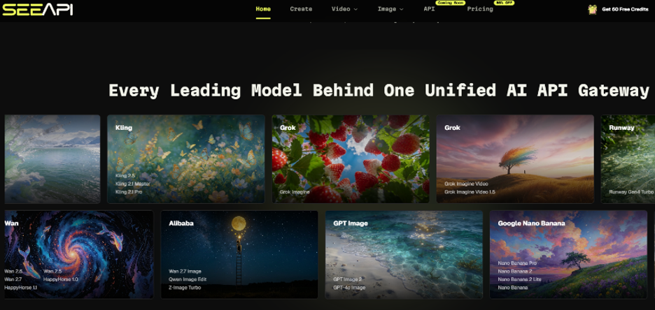
SeeAPI’s image workspace is built to generate and edit through one gateway. Before you touch models, lock the asset you will judge against. Capture a clean specimen at the size you will publish—not a phone photo of a monitor, not a heavily compressed social crop.
Free accounts advertise about ten credits a month with watermarked exports. That is enough to prove the battery, not enough to publish commercial comps. Paid paths advertise HD watermark-free exports and commercial usage. Decide which lane you are in before you screenshot anything for a client deck.
Write A Glyph Kill Checklist On Paper
Keep three checks only: counters stay open, stems stay even, and any on-image word remains readable at final crop. If a check fails, discard the take. Do not “fix the prompt until it feels designer.”
Tape the checklist beside the keyboard. When I opened a failed export without the list, I regenerated twice before I noticed the crossbar had drifted. The list makes the same mistake boring and fast to kill.
Run A Three Cell Dirty Battery
Use the same locked specimen as the reference each time. Change only the stress on the input. This is a test protocol for letter fidelity, not a model beauty contest.
| Cell | Input stress | Pass signal | Kill signal |
| Clean | Sharp specimen + short prompt naming the job (UI header mock) | Counters open; stem weight stable next to the original | Bowl fill; crossbar drift |
| Compressed | Same specimen saved as a small JPG, then reused as reference | Edges still crisp enough to name the family | Halos; letters look like another face |
| Busy background | Specimen over a noisy UI screenshot | Type separates from chrome | Glyphs merge into icons or gradients |
In my testing posture for this battery, I kept the asset fixed and only changed compression or background clutter. When I placed the compressed cell beside the original, soft edges showed up before any layout debate started. If 2 of 3 cells fail on counters, stop the session and fix the reference file.
Pick Models For Edges Not For Vibes
Public image floors on the site list different per-image prices across families such as GPT Image 2, Nano Banana Lite, and Flux Kontext routes. For type samples, route first toward whatever keeps small strokes honest on your clean cell. Save cheaper lite routes for thumbnail exploration only if the clean cell already passed. Do not collect every homepage logo—pick one route that survives cell two.
SeeAPI keeps those routes behind one balance that never expires, which helps when a draft article slips a week. It does not help if you burn the clean-cell win by switching models for entertainment.
Attach Reference Before You Rewrite Adjectives
If the first export fails, attach the locked specimen again and shorten the prompt to geometry words: contrast, x-height, sharp terminals. Adjective stacks like “premium editorial texture” are how bowls fill in. SeeAPI will still spend credits on a vague prompt; the battery exists so you stop paying for vagueness.
Common Errors That Burn Credits Without Teaching
Judging at half size. Publishing a watermarked free export as if it were a license-safe figure. Switching models every click without logging which cell failed. Cropping after the fact so a barely-passable stem becomes unreadable in the article width.
Failed jobs that never return a usable result should not consume credits under the published policy, and the UI refunds failed image generations. That protects the ledger. It does not protect you from regenerating the same soft “a” ten times because you never reattached the specimen.
Log Kills Before You Change Models
Log one line per kill: cell name, what warped, whether the reference was attached. Without that line, tomorrow’s session repeats today’s afternoon.
A second error is mixing jobs. Do not use the same generate click to invent a fake UI and to prove a font match. Split those tasks. Identity for type needs a locked specimen. Mood boards can wander. If you blend them, the battery stops teaching anything because you no longer know which requirement failed.
Where This Workflow Still Needs A Human
No gateway replaces a license check. If your article claims a free alternative matches a premium face, you still verify EULA and specimen sources yourself. AI image edits can illustrate a layout argument; they cannot swear a font file is redistributable. Keep generative mocks labeled as mocks when the legal claim matters.
Also keep a human eye on pairing advice. A model can render a bold display face that looks sharp and still be the wrong recommendation for body text at 16px. Your article’s value is the pairing judgment. The generate step only supplies a figure that will not embarrass that judgment.
Stop Regenerating Soft Letter Edges Now
Run the three-cell battery once per article figure. If the compressed cell fails, fix the reference or kill the figure—do not chase a prettier vibe. Keep SeeAPI spend on the clean cell that already proved edges, and move paid watermark-free exports only when the figure will ship.
Font readers came for discrimination. Give them letter edges that still hold when placed next to the original specimen. Everything else is decoration that burns credits without teaching the next draft.