
From Wood Type To The Casino Lobby: The Typefaces Entertainment Actually Runs On
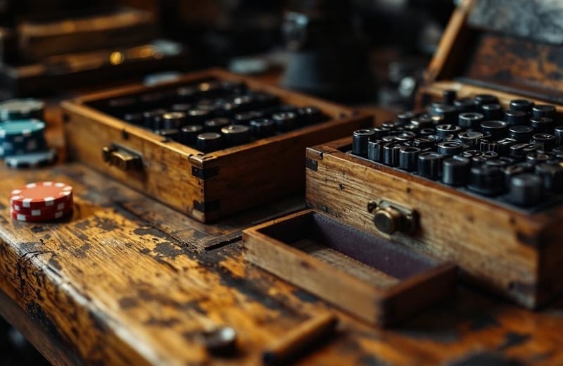
Entertainment lettering has one job that book type never had: it has to be read by someone who did not choose to read it. A theater bill on a wall, a circus poster on a fence, a casino name on a roadside pylon and a game tile in a phone lobby all compete for a glance that was headed somewhere else. That constraint shaped every face the sector keeps returning to.
It also explains why the category has its own vocabulary. Showcard lettering, tuscan and French Antique wood type, hand-drawn neon script and the Las Vegas pylon each solved the same problem with different tools, and each left behind typefaces that designers still license or download today. Some of those faces carry the wrong origin story. Playbill, the font everybody files under “cowboy,” came out of Sheffield in 1938.
This piece follows the lineage from the wood type shops of the 1880s through the neon studios of the 1950s to the web fonts that sweepstakes casino lobbies were serving on 18 September 2026, when I read their stylesheets. The last stop turned out to be the most surprising, because the operators reached for sign revivals without appearing to know it.
Hamilton Cut The Poster Alphabet Before Anyone Called It Entertainment
The Hamilton Manufacturing Company began cutting wood type in Two Rivers, Wisconsin, in 1880 and grew into the largest and longest-running wood type maker in the country. The museum that now occupies its legacy holds 1.5 million pieces across more than 1,000 styles and sizes of pattern, and that inventory is effectively the catalog of show lettering before the electric sign existed.
Wood type solved a physical problem. Metal type much above an inch tall was heavy and expensive to cast, so the circus, the theater and the traveling show bought letters cut from end-grain maple. The styles that sold were the loud ones: tuscans with split, curling serifs, clarendons with ornament carved into the strokes, and the reverse-contrast French Antiques whose thick horizontals read across a street.
Adobe revived the best of that catalog in 1994. Rosewood, drawn by Kim Buker Chansler, Carl Crossgrove and Carol Twombly, follows the Clarendon Ornamented that William H. Page first showed in his 1859 specimen book. It shipped as a two-layer chromatic design, the fill and the ornament as separate fonts to be overprinted, exactly as a nineteenth-century printer would have run two passes in two colors.
Playbill Is A 1938 Sheffield Revival, Not A Wanted Poster
Playbill is the face that every frontier-themed slot reaches for, so its provenance matters. Robert Harling oversaw it for Stephenson Blake, the Sheffield foundry, in 1938. It reinterpreted nineteenth-century French Antique wood type, sitting between an older, wider cut and a more compressed one, and its defining trick is reverse contrast: the horizontal strokes carry the weight and the verticals stay thin.
That inversion is what makes it work on a poster and fail in a paragraph. The heavy slabs lock into a horizontal band that the eye reads as a single shape from a distance. Fonts In Use records it on the 1968 poster for Once Upon a Time in the West and on cinema posters from around 1960, which is a fair map of where the face lives.
Microsoft ships Playbill inside Office, which is why a 1938 Sheffield revival of a French-named wood type is now the default signal for “saloon” on slot glass and in casino lobbies worldwide. The font trade calls the style Italienne, French Antique or French Clarendon depending on the catalog. None of those names is wrong, and not one of them is homegrown.
Showcard Gothic And Broadway Went From The Lobby To The Marquee
Showcard lettering was a trade before it was a font. Department stores, theaters and dance halls employed card writers who lettered prices and bills by brush, working from printed model alphabets. Jim Parkinson, the lettering artist who drew the Rolling Stone masthead, researched those models for Font Bureau and released Showcard Gothic in 1993. He died in 2025.
The foundry’s own note says the face was derived from the showcard models prepared for lettering artists in the twenties and thirties, and that description is exact: the letters lean, the counters pinch, and the whole alphabet looks brushed rather than drawn.
Broadway took the other route into entertainment. Morris Fuller Benton drew it as a capitals-only display face for American Type Founders in 1927; Sol Hess added an inline version in 1928 and a lowercase in 1929 for Monotype. ATF dropped it from the catalog in 1954, and by then it had become shorthand for the theater district it was named after.
The arcade and the slot floor picked it up next. Namco’s 1983 arcade game Mappy carried a Broadway logo on its cabinet marquee, credited to Hiroshi Ono, in outlined caps with a drop shadow. Yamasa’s Planet T pachislot machines of around 1985 used Broadway on their medal labels. A 1927 theater-district typeface ended up on a pachislot cabinet within sixty years.
Betty Willis Drew The Script By Hand And Never Trademarked It
Neon script belongs to the sign studio, not the type foundry. YESCO, the sign company behind many of the classic Las Vegas pylons, started in 1920 as a paint-brush operation and built its first neon spectacular in 1945 from plans drawn by hand on butcher’s paper.
Betty Willis worked for YESCO, Western Neon and Ad Art in turn. She had studied French-style lettering, and the Neon Museum credits her with hand-drawing the swooping script for the Moulin Rouge sign in 1955.
Four years later, at Western Neon, she designed the Welcome to Fabulous Las Vegas sign that the National Register listed in 2009. She never registered the design, and it passed into the public domain during her lifetime. She died in 2015.
The Stardust letters show the other neon idiom. Kermit Wayne of YESCO drew them in 1958 in what the museum describes as a futuristic, cartoon-like style built from atomic-age motifs, and in 1968 Paul Miller of Ad Art built the pylon that carried the name, 188 feet tall and 90 feet wide.
Tom Wolfe Had To Invent Names For The Shapes
None of that lettering had a name a typographer would recognize, and the sign trade did not supply one. When Tom Wolfe wrote up Las Vegas for Esquire in February 1964 he found a skyline made of signs rather than buildings and a set of forms that, in his phrase, sat far out beyond the frontiers of conventional studio art.
So he coined the labels himself: Boomerang Modern, Palette Curvilinear, Flash Gordon Ming-Alert Spiral and the rest. That was the defining condition of casino lettering for half a century. Each sign was a one-off, drawn by a named designer at a named studio, bent by hand and never issued as a font. A rival could copy the mood but not the file.
The online casino lobby reversed every part of that. Its lettering arrives as a named, versioned, downloadable family with a license file, and the question a type designer asks on opening one is simply which family it is.
What A Sweepstakes Casino Lobby Actually Loads
I answered that question the way a type designer would, by reading the stylesheets. On 18 September 2026 Chumba Casino and Global Poker, two VGW brands, served the same self-hosted Montserrat build in five weights from regular to black, in a stylesheet chunk that shared its file name across both domains. Two brands with different wordmarks were running one typographic system underneath.
LuckyLand Slots pulled Archivo at bold weight and Inter at light and regular from Google Fonts. WOW Vegas loaded Plus Jakarta Sans at bold and Barlow Condensed at semibold from the same servers. Every family in that sample is open-licensed and free, which is a long way from Stephenson Blake selling Playbill by the pound.
The check takes a browser inspector and about a minute per site, so anyone working down a list of sweepstakes casinos from LineUps can repeat it on the brands this piece did not open. Four operators are a sample, not a census.
What the sample does show is a lobby with two typographic registers. The operator’s own interface type is quiet and systematic. The noise comes from the game tiles, where each studio ships its own title lettering with the game, so that the grid reads like a wall of competing showcards set inside one calm frame.
| Designer | Typeface or sign | Origin | Entertainment use on record |
| Robert Harling | Playbill | Stephenson Blake, Sheffield, 1938 | Once Upon a Time in the West poster, 1968 |
| Morris Fuller Benton | Broadway | American Type Founders, 1927 | Mappy arcade marquee, 1983 |
| Jim Parkinson | Showcard Gothic | Font Bureau, 1993 | Cool and Strange Music Magazine, 1998 |
| Kim Buker Chansler, Carl Crossgrove, Carol Twombly | Rosewood | Adobe, 1994, after Page’s 1859 Clarendon Ornamented | Color font version released June 2026 |
| Betty Willis | Welcome to Fabulous Las Vegas sign | Western Neon, 1959 | Listed on the National Register in 2009 |
| Kermit Wayne | Stardust letters | YESCO, 1958 | Preserved in the Neon Museum boneyard |
| Julieta Ulanovsky | Montserrat | Kickstarter, 2011, from Buenos Aires signage | Chumba Casino and Global Poker interface, 2026 |
| Jeremy Tribby | Barlow Condensed | Open license, after California road signage | WOW Vegas interface, 2026 |
The Lobby Fonts Are Sign Revivals Too
Montserrat began in 2010 as a postgraduate project by Julieta Ulanovsky in Buenos Aires and reached Google Fonts through a 2011 Kickstarter. Her pitch described old posters and signs in the Montserrat neighborhood of that city, urban lettering from the first half of the twentieth century that she wanted to rescue before redevelopment removed it.
The face that runs two sweepstakes lobbies is a street-sign revival, and Barlow is the same story from a different place. Jeremy Tribby drew it from the visual style of California’s public realm, and his own description lists the state’s car plates, highway signs, buses and trains as its sources.
Archivo, from the Buenos Aires foundry Omnibus-Type, is a grotesque its designers describe as reminiscent of the late nineteenth century, the era when Hamilton was cutting wood.
Plus Jakarta Sans is the outlier, and even it came from civic identity work, commissioned for a Jakarta city program in 2020. So the casino lobby of 2026 is set, almost entirely, in faces derived from wayfinding and street signage. The trade that Tom Wolfe watched inventing unnamed shapes in 1964 now runs on named revivals of the vernacular it once produced.
Off its own domain a publisher gives up its type altogether. Whatever LineUps posts at x.com/Lineups_US renders in Chirp, the typeface X rolled out in August 2021 after developing it with the foundry Grilli Type, and only the avatar and banner images escape it. The same is true of every operator’s account: the platform font wins, and the wordmark survives as a picture.
Chromatic Wood Type Came Back As A Color Font
The lineage will keep looping. Rosewood, the 1994 revival of an 1859 chromatic wood type, gained a color font version in June 2026, which means the two-pass circus poster of the Page era now renders as a single web font in a browser. The museum in Two Rivers still runs working pressrooms, and its pattern collection is the reference for anyone drawing the next casino tuscan.
For a designer, the practical lesson is that the entertainment sector has never invented its own type. It borrowed the poster trade’s wood letters, the card writer’s brush alphabets, the sign painter’s script and, most recently, the open-source revivals of all three. The next lobby wordmark will come from the same well, and the shortest route to a convincing one is still a specimen book from 1859.