
The White Box Around Your Signature Is a Transparency Problem, Not a Design Choice

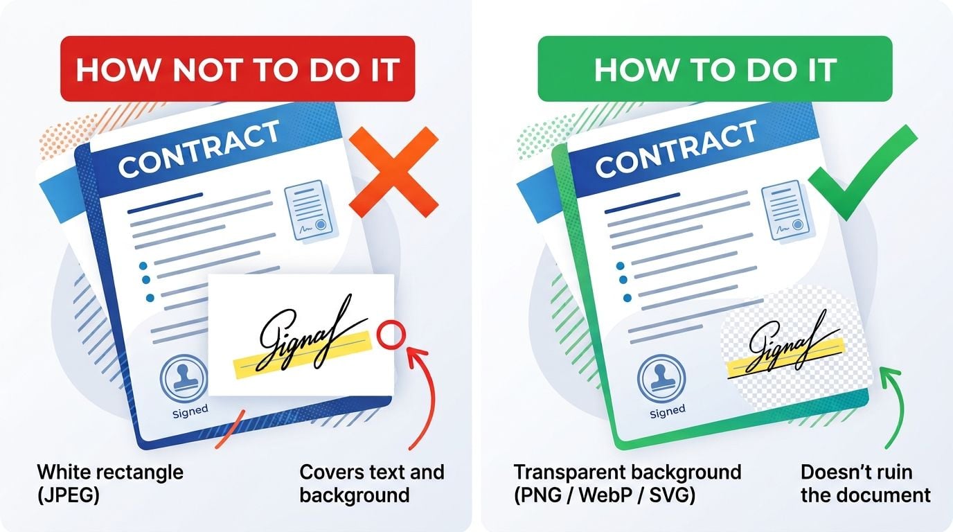
Drop a signature image onto a contract and one of two things happens. It sits on the page as though it were written there. Or it arrives inside a white rectangle that covers the line, part of the text, and any border it overlaps.
The second version is the default from a surprising number of signature tools, and the cause is simple: the file was saved as JPEG, or as a PNG that was flattened onto white before export.
Why JPEG cannot do this
JPEG has no alpha channel. There is no way to express “this pixel is nothing” in the format.
Every pixel gets a colour, so the area around the strokes gets the nearest available colour, which is white. On a white page that’s invisible and everything looks fine, which is exactly why the problem ships. Put the same file on a form with a grey field, a coloured header or a ruled line, and the rectangle appears.
PNG supports alpha. So does WebP, and so does SVG, which is arguably the right format for a signature and almost never offered.
The second failure: anti-aliased edges on the wrong background
This one is subtler and survives the format fix.
A signature drawn on a white canvas has anti-aliased strokes, meaning the edge pixels are blends between the ink colour and the canvas colour. Export that with transparency by keying out the white, and the blended pixels keep a white component. On a white page you’ll never see it. On a darker background the strokes get a pale halo.
Proper transparency means the alpha was there while the stroke was drawn, not removed afterwards. Tools that render to a transparent canvas from the start don’t have this problem. Tools that background-remove after the fact usually do, and the difference only shows up when someone places the file on a coloured document. If you’re rescuing an existing signature that was saved onto white, there’s a walkthrough of stripping the background properly that covers where the halo comes from and how far it can be cleaned up.
Drawn versus typed, as a typographic question
Signature tools generally offer two paths, and they behave differently at small sizes.
A drawn signature is a path captured from pointer movement. It carries the irregularity of the hand that made it, which reads as personal. It also degrades unpredictably when scaled down, because thin strokes at low resolution either disappear or get muddy.
A typed signature rendered in a script face is type. It has consistent stroke weight, proper hinting behaviour, and it stays legible when a document gets scaled to a thumbnail or printed at reduced size. It also looks like type to anyone paying attention, because the letterforms are too regular.
Which is better depends on the document. For something that may be viewed as a small preview or faxed, and yes that still happens in some sectors, the typed version survives better. For something where the mark’s personality matters, the drawn version is the point.
Choosing between them is less arbitrary than it looks. Legibility, stroke count and how the mark behaves at 30% scale all matter more than whether it looks impressive at full size, and there’s a comparison of how to design a signature you’ll actually use that runs through five styles against those constraints rather than aesthetics alone.
Sizing, because this gets ignored
Export at more resolution than you think you need. A signature that looks crisp at 200px wide on screen will look like a smudge when the document is printed at 300 dpi.
Rough guidance: for a signature occupying about 5cm on a printed page, you want something in the region of 600 pixels wide at minimum. Oversized is harmless since PDF scales it down cleanly. Undersized is not recoverable.
Keep the crop tight to the strokes with a little breathing room. Excess transparent margin isn’t visible but it makes positioning fiddly, because you’re aligning an invisible bounding box rather than the visible mark.
Tools differ on how much of this they handle. Chaindoc’s signature generator renders to a transparent canvas and exports the PNG directly, so the alpha is native rather than keyed out afterwards. It needs an account, with creation and storage on the free tier, and the mark is stored so the next document doesn’t need another drawing session.
The thing worth saying out loud
All of this is about how a signature looks. None of it affects what the signature proves.
A transparent PNG is a picture. Anyone who receives it can lift it off your document and place it on another one, and the result is indistinguishable from the original. Nothing in the image records who applied it, when, or to what.
For a delivery note or an internal form, that’s completely fine and always has been. For a contract, the visual is the presentation layer over a signing process that captures authentication and a timestamp, and the picture is the part that matters least.
Getting the transparency right is still worth doing. Just for the right reason: it makes documents look like documents rather than like something assembled in a hurry.