9 Top AI Chart Generators for Presentations and Slide Decks in 2027

Waiting for a stubborn chart to snap into place can feel endless. One study estimates that manual tweaks still swallow 37 percent of slide-building time for the average team. In 2026, AI finally shoulders that drudgery: feed in your spreadsheet, get an on-brand visual, and move on. After stress-testing the options, we narrowed the field to nine tools. Some sit inside PowerPoint or Google Slides, others focus on design polish, and a few even explain the numbers for you—yet all return hours to your week.
How we picked the nine

We’ve all seen “best tool” posts that simply copy a pricing table. We chose a tougher path.
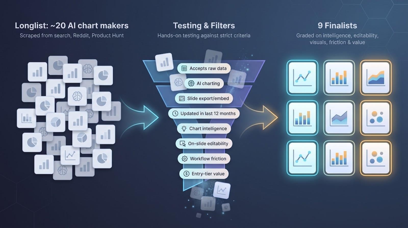
First, we scraped every first-page result, Reddit thread, and Product Hunt launch from the past year, building a longlist of about twenty AI chart makers.
Next, we tested them. Each candidate had to do four things: accept raw data, apply AI to pick or style the chart, export or embed into a slide, and show active updates within the last twelve months.
Finally, we graded them on chart intelligence, on-slide editability in PowerPoint or Google Slides, visual range, workflow friction, and entry-tier value. The nine survivors are the ones that save time instead of stealing it.
At-a-glance comparison
Before we explore each tool, it helps to see the field on one page. We stacked the nine finalists against the criteria that matter most when you’re racing a deadline: where the AI lives, how smart it is, and whether your finance team will sign off.
| Tool | Best For | AI Muscles | Slide Integration | Free Tier | Starting Price |
| Plus AI | Teams living in Google Slides or PowerPoint | GPT-4 chart & deck drafts | Native add-in | Yes | ~$10 user/mo |
| Microsoft Copilot | Enterprises on Microsoft 365 | GPT-4 assist; Excel data link | Native ribbon | Trial only | ~$30 user/mo |
| Beautiful.ai | Design-first pitch decks | Auto-layout & chart polish | Export to PPTX | Limited trial | ~$12 mo |
| Canva Magic Charts | Non-designers needing speed | Layout suggestions | Export PPTX | Yes | ~$15 mo |
| Visme | Multi-format visual content | Prompt-to-slide & AI charts | Export PPTX | Yes | ~$12 mo |
| Infogram | Interactive dashboards | Chart recommendations | Embed / export | Yes | ~$19 mo |
| Julius AI | Chat-style data analysis | NLP questions → charts | Image export | Yes | ~$35 mo |
| ChartGen AI | Instant CSV-to-chart | Auto chart selection | PNG / SVG / PDF | 100 credits/mo free (ChartGen AI) | ~$20 mo |
| Piktochart | Infographic-ready visuals | Describe-to-graph | Export PPTX | Yes | ~$14 mo |
Keep two points in mind as you scan the grid.
First, “native” means the chart lands in PowerPoint or Slides as a fully editable object: no copy-pasting images, no last-minute font mismatches. Second, every pick here offers at least a taste for free, so you can pressure-test their AI on your own data before your next board deck.
1. Plus AI: instant charts, zero friction
Picture this: you’re staring at a blank Google Slide five minutes before the status meeting. Plus AI sits in the sidebar, waiting for a cue, and because it runs directly inside Google Slides and PowerPoint everything you create stays fully editable (https://www.plusai.com). Paste your numbers or type “Q2 revenue by region,” hit Generate, and a branded, editable chart snaps into place.
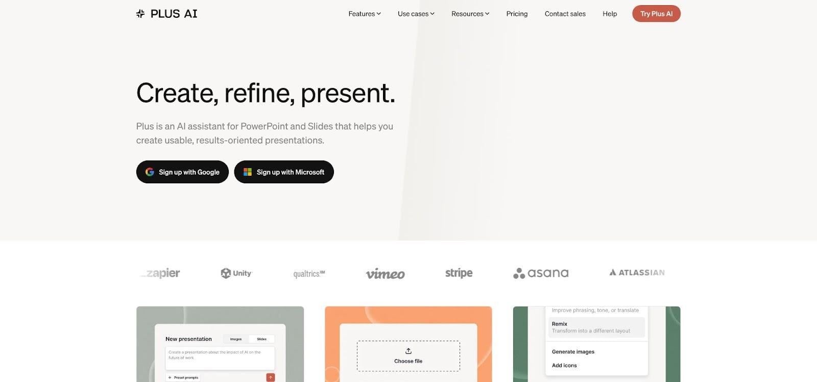
Plus AI Google Slides sidebar chart screenshot
Because the add-on lives inside Google Slides and PowerPoint, you never juggle windows or settle for flat images. Every bar, label, and color stays fully editable, so last-second tweaks are painless.
The UX is famously simple. One Reddit tester called it a “zero learning curve” upgrade for any team that already lives in Slides. That ease pairs with speed: whole slide drafts arrive in seconds, complete with speaker notes if you need them.
Pricing starts around ten dollars per user each month, a small price to avoid late-night chart-wrangling. Try the free tier first; you’ll know within one deck whether it deserves a permanent spot in your toolbar.
2. Microsoft Copilot: AI charts that stay inside the Microsoft 365 walls
Copilot sits one click away in the PowerPoint ribbon. Ask for “a bar chart of last quarter’s sales by region,” and it reaches into the linked Excel workbook, builds the graph, and drops it onto the current slide, fully editable and already wearing your template’s colors.
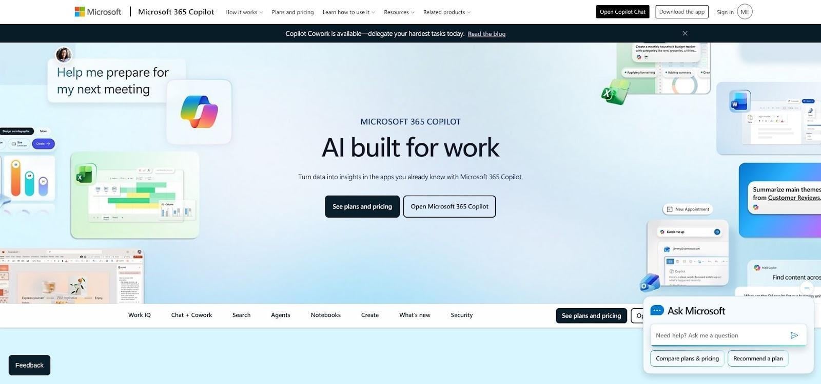
Microsoft Copilot PowerPoint AI chart creation screenshot
Security teams appreciate this flow because nothing leaves the tenant. Copilot follows the same permissions, encryption, and audit trails that already guard Outlook and SharePoint files, so data stays where Finance says it must.
The real payoff is speed. Early pilots showed users gaining back 1.2 hours a week by asking Copilot to draft slides and charts, then focusing on the story instead of wrestling with axes and labels.
Seats cost more than most add-ins, yet if your company is all-in on Microsoft 365, Copilot feels less like another tool and more like built-in muscle for the suite you already pay for.
3. Beautiful.ai: designer polish without the designer
If Plus AI and Copilot focus on working inside your slide software, Beautiful.ai flips the script. You build the whole deck in its cloud studio, and the platform enforces good design like a tireless art director.
Start with a Smart Slide that already contains a placeholder chart. Drop in your numbers, and the layout snaps into alignment. Switch from bar to pie, and labels, legend, and spacing adjust at once. No nudging boxes pixel by pixel.
That auto-layout intelligence shines when you add more content. Resize the chart or insert a bullet, and Beautiful.ai recalculates the grid so nothing looks cramped or crooked. The result matches brand guidelines without you sweating hex codes or font ratios.
Exports arrive as editable PowerPoint files or shareable links, so stakeholders who still live in PPT can tweak copy without breaking the layout. The free trial shows off the engine, but larger teams choose the Pro plan for unlimited projects and brand kits.
If you dread design review more than data crunch, this might be the shortcut you need.
4. Canva Magic Charts: the familiar canvas gets an AI bump
Most of us already crack open Canva for social posts or one-pagers. The Magic Design upgrade now extends that ease to charts. Type a topic or paste a small data table, and Canva suggests slide themes, color palettes, and a chart style that fits.
Editing feels like play. Drag a series handle, and the bars stretch in real time. Switch the theme, and your chart, background, and fonts all harmonize with one click. It’s the quickest path to “wow, that looks professional” when design isn’t your day job.
Because Canva runs in the browser, collaboration stays painless. Share the link, and a teammate can tweak copy or adjust colors at the same time; no version-control nightmares.
For deck delivery, export to PowerPoint if the client insists, or present directly from Canva’s full-screen mode. Just note that the PPT export flattens the chart into an image, so lock final numbers first.
The free plan covers basic charts, but the real value lives in the Pro subscription. If you already pay for Canva to handle other marketing assets, Magic Charts feels like a bonus upgrade.
5. Visme: one stop shop for charts, slides, and everything visual
Visme feels like Canva’s data-loving cousin. Open a project and you can draft a slide deck, an infographic, or even a social post, all from the same dashboard. The AI “Presentation Wizard” jump-starts the deck, then the chart generator takes over.
Describe the visual you need (“line chart of website traffic over six months”) and Visme seeds a dummy graph that matches the request. Swap in your real numbers or connect a Google Sheet for live updates. The styling inherits your brand kit automatically, so charts land on-brand without extra clicks.
What sets Visme apart is breadth. Beyond standard bars and pies, you get maps, flowcharts, and interactive widgets. If you later share the deck online, viewers can hover or click to explore the data, something flat PowerPoint exports can’t match.
The trade-off is complexity. A fuller toolbar and a steeper learning curve than Canva mean you’ll spend time mastering the workflow, yet once you do, you can spin up every visual asset your team needs from a single account.
Pricing matches that depth. The free tier works for tests, but serious chart work calls for the Business plan. If your content calendar includes reports, social teasers, and board decks, Visme might replace three separate subscriptions with one.
6. Infogram: interactive charts that outshine static slides
Some data needs room to breathe. Infogram specialises in visuals viewers can hover, filter, and zoom. Paste a dataset or link a live Google Sheet, and the AI selects a fitting chart. Geography prompts one of 500 maps, while time-series data defaults to a trend line with automatic call-outs on peaks and dips.
For slide decks, you can export a crisp PNG, but the real advantage is the share link. Present in a browser and invite the audience to explore, or embed the interactive chart inside a web version of your deck. Stakeholders can inspect the figures without asking “can you slice it this way?” afterward.
Infogram offers depth: more than 45 chart types, animated transitions, and simple theme controls. Yet the interface stays friendly for non-analysts. The free tier lets you test basic charts; upgrade to unlock private projects and high-resolution downloads.
If your story lives beyond bars and pies, and especially if you publish decks online, Infogram turns passive slides into conversations.
7. Julius AI: chat with your data, get the chart
Julius feels less like software and more like a junior analyst on call. Upload a CSV or point it at a Google Sheet, then start a plain-English chat: “Show quarterly growth by product,” or “Is there a correlation between ad spend and sign-ups?” Seconds later, Julius replies with both the insight and a ready-made visual.
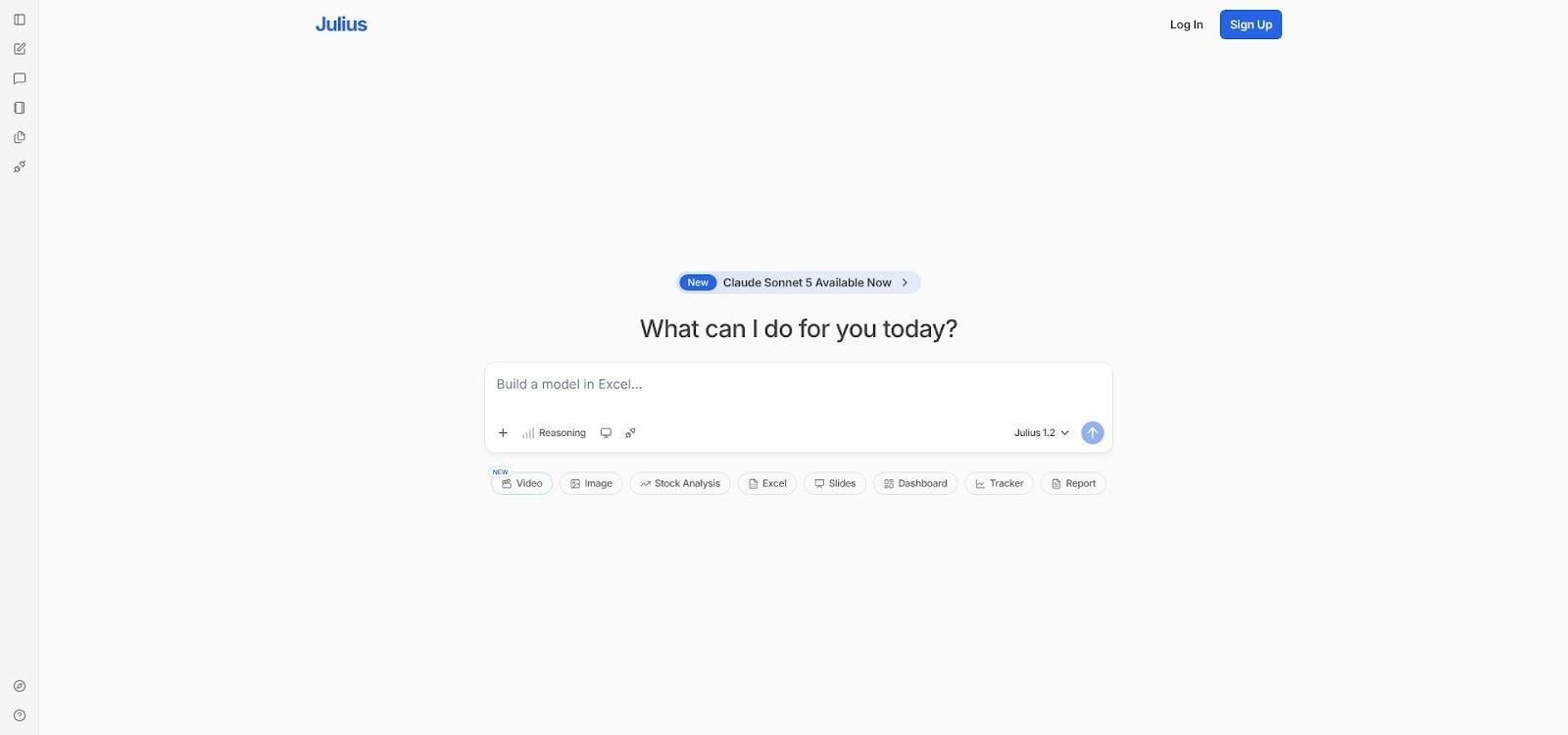
Julius AI data chat interface with generated chart
Because it runs real analytical libraries under the hood, you’re not limited to business-basic bars and lines. Ask for a histogram, a boxplot, or a scatter with a regression line, and Julius delivers—no code required.
Charts download as high-resolution images you can drop into slides, but the bigger benefit is rapid discovery. Instead of poking at pivot tables, you ask questions until the story crystallises, then export the key graphs.
Heavy Excel users will appreciate that Julius also generates formulas or SQL snippets on demand, turning ad-hoc findings into repeatable calculations.
The free tier is generous for light exploration. Serious number-crunchers upgrade for larger datasets and priority processing, effectively renting a data analyst for the price of a streaming subscription.
8. ChartGen AI: from CSV to polished chart in one breath
Sometimes you don’t need a full design suite or analytical deep dive. You just have a spreadsheet and a meeting in ten minutes. ChartGen is built for that moment.
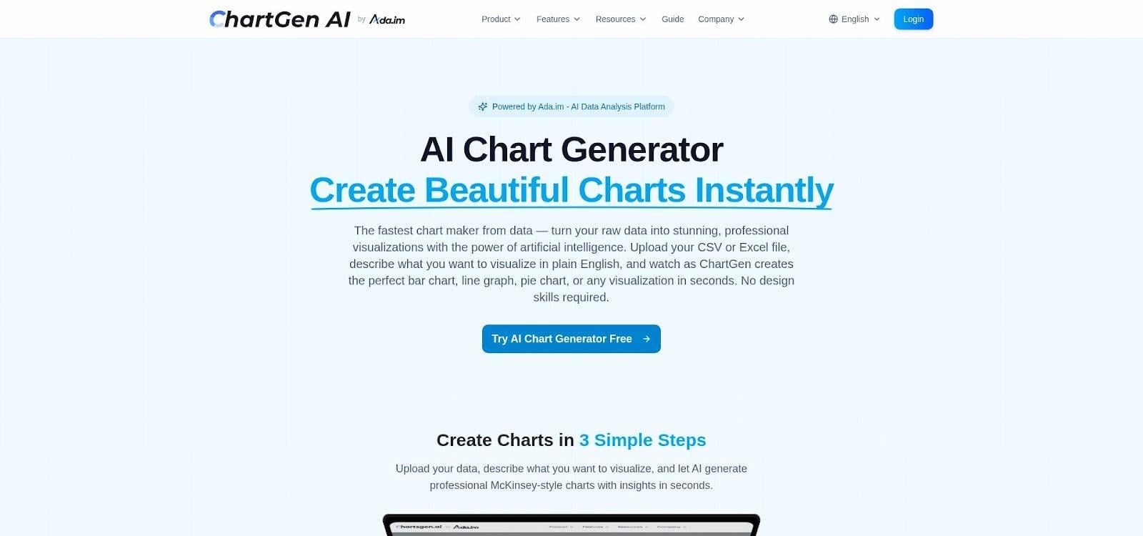
ChartGen AI CSV to chart generator interface screenshot
Drag your CSV onto the page, or paste the raw numbers. The AI inspects the structure, chooses a fitting visual, and renders a clean chart in seconds. If you want a say, add a quick prompt—“trend of revenue vs expenses”—and the engine follows your lead.
The editor stays minimal: tweak colors, adjust labels, and you’re done. Export as PNG, SVG, or PDF and drop it into your slide. Need more? The Pro tier gives unlimited charts and higher-resolution outputs, but the free plan alone grants 100 credits per month, enough for most weekly decks.
By focusing on one task and finishing it fast, ChartGen earns a permanent bookmark for anyone who’d rather spend time on the story, not the settings.
9. Piktochart: infographic flair for data stories
Piktochart earned its reputation by turning plain numbers into eye-catching infographics, and its new AI Graph Generator brings that flair to slide charts. Describe the visual—“bar chart comparing apples, bananas, oranges at 30, 50, 20”—and the tool drafts it instantly, already wrapped in bold colors and friendly icons.
Because each chart stays inside Piktochart’s drag-and-drop canvas, you can surround it with illustrations, call-outs, or a quick narrative block. That extra context turns a lone graph into a mini story the audience grasps at a glance.
Export to PNG for simple slide drop-ins, or generate a full PPTX if you want the whole deck styled the Piktochart way. Just remember: once inside PowerPoint the chart is a static image, so lock edits before exporting.
Educators, marketers, and anyone tasked with “making numbers pop” will feel at home here. The free tier covers five active projects, while the Pro plan opens unlimited visuals for roughly the cost of a couple fancy coffees each month.
FAQs
Are AI-generated charts editable once they hit my slide?
For tools that live inside PowerPoint or Google Slides (Plus AI, Copilot, and Visme), the chart remains a native object. You can double-click, tweak a label, or paste new numbers and the visual updates on the spot. If you export from Canva or Piktochart, the chart flattens into an image, so lock the data first.
How steep is the learning curve?
Most picks feel familiar within minutes, and Plus AI users on Reddit called the add-in a “zero learning curve” upgrade for Google Slides. In short: if you can write a prompt, you can drive these tools.
What’s the best free option for quick, no-frills charts?
ChartGen’s free plan gives you 100 credits per month with every chart type unlocked. That’s plenty for weekly status decks or student projects.
Is my data safe in the cloud?
All nine vendors encrypt uploads in transit. Enterprise-focused platforms (Microsoft Copilot and Plus AI included) inherit or advertise SOC 2 and GDPR compliance. Still, if your dataset is highly confidential, consider on-prem Excel charts or redacted samples instead of raw client tables.
Will AI pick the “right” chart for me every time?
Expect smart defaults about 80 percent of the time. Feed the AI a time-series and you’ll likely see a line chart. Need something else? Override it in a click. Think of the AI as a fast first draft, not an infallible art director.
Why pay for a tier when free plans exist?
Free tiers are great for experiments, but they limit monthly generations, export resolution, or brand controls. If you present every week—or answer to brand police—those caps break fast. Upgrading often costs less than an hour of your billing rate and spares many more hours of manual formatting.
Conclusion
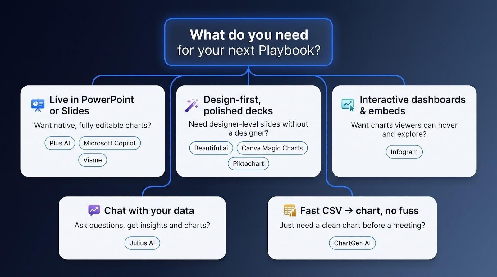
With the key questions covered, here’s a quick playbook for choosing the right tool for your next deck.